Sunday, June 17, 2012

1. 1450-1467


THIS BLOG IS MY ATTEMPT TO PRESENT IN LOGICAL ORDER MY CONTRIBUTIONS TO A TAROT HISTORY FORUM THREAD AT http://forum.tarothistory.com/viewtopic.php?f=12&t=463, WITH REVISIONS DONE IN JUNE OF 2012 AND PARAPHRASES OF THE OTHER MAIN PARTICIPANT'S OBJECTIONS. ON PARTICULAR POINTS, THERE MAY BE FULLER DISCUSSION IN THE THREAD ITSELF.

THIS BLOG IS ARRANGED LIKE A BOOK, GOING DOWN THE PAGE FROM THE TOP DOWN AND FROM "NEWER POST" TO "OLDER POST."

My hypothesis, for which I am going to try to provide evidence, is that the so-called "tarocchi of Mantegna" started with three of the "Belfiore Muses" of c. 1449 Ferrara, which was expanded into more in the same style, more probably Bologna than Ferrara, starring as early as the 1450s, and then converted to the new technology of engraving by 1467, probably there as well.

Actually, it is not my idea, but my version, incorporating the new research, of an old idea once advocated by Venturi (1931) and included by Hind (1938) in his survey of the options.. I will present their views in relation to both the current art historians, who have declared for 1460's Ferrara, and Trionfi, which prefers c. 1474-1475 for the complete set of designs and Rome for the engravings. At the risk of giving you too much information,  Details of abbreviated references are at the end.

HIND'S VIEWS ABOUT THE DESIGNER OF THE "MANTEGNA"

These scans are taken from a book that is not easily accessible, Arthur M. Hind's Early Italian Engravings. The copy to which I have access, in a nearby college library, says it is one of 375 copies signed by Hind.. So to be sure that we are getting him correctly, untilfiltered through my imperfect editing of him, I will post scans of the relevant sections, He begins by saying that the style is Ferrarese, and asking, could any of known artists of Ferrara have designed the cards? He starts with del Cossa. Here is his the beginning of his text:
Image
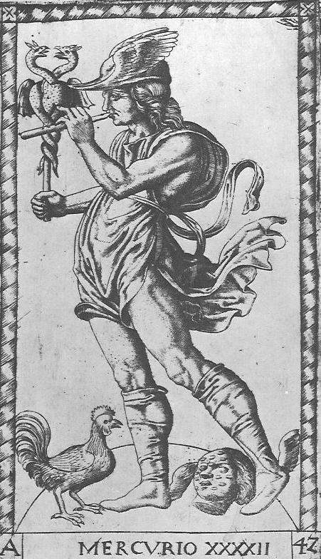
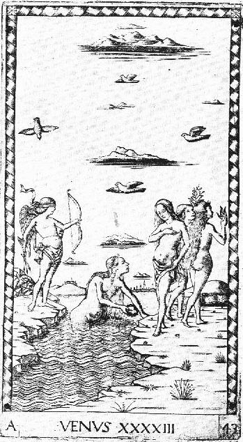
It has been known since 1885 that del Cossa only claimed credit for March, April, and May. The Triumph of Venus is the upper part of April, and Mercury that of June. Different historians have seen resemblances to the cards in nearly every section of the Schifanoia. I will post side by side comparisons later..

Next Hind considers Gombosi's and Clark's idea of Angelo Parrasio, the painter that Leonello put in charge of the Belfiore Muse project. Here is what Hind says:
Image
Notice here that Hind picks out  three of the Belfiore Muses. I will start my own investigation with them. But Angelo could not have designed the engravings, Hind reasons, because he died in 1456, and "it seems difficult, on technical grounds, to place the engravings before 1460, and I think 'about 1465' a more probable date." Few historians today identify the artist of any of the three as Angelo; instead they say "anonymous Ferrarese," as we shall see. Whichever artist it was, Hind says, "this group of painters [i.e. the Belfiore artists] exercised considerable influence" on "our engraver." Hind talks about two persons being involved:. one is the artist, the other a technician who renders the artist's work in copper. Hence a design, it seems to me, could outlive its designer and be rendered in a technically later engraving.

Not seeing any candidates among the master-painters, Hind turns to the miniaturists and] the designers of cards and other decorative items. Although he thinks the miniaturists are more probable as designers of the "Mantegna" than the painters of larger works, he finds the style of those in Ferrara more like the "true tarocchi" than the Mantegna Of the card-makers,:he thinks they are the most likely to have designed the "Mantegna." In the selection below, I go to the end of Hind's discussion, in which he not only discusses the designer but makes his by-now famous suggestion as to the engraver. Start on the fifth line below.
Image
The next to last paragraph here Is quoted by Trionfi in their section "Hind's final suggestion" at http://trionfi.com/0/m/00/. We shall see that it is not Hind's "final suggestion." I will quote more of Hind, from his section G.2 to which he refers, in a later discussion, when I come to the question of the engraver.

THE BELFIORE MUSES

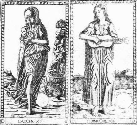
The first question I will address is this: in the style of what artist are the designs? To focus this question, here are two paintings done c. 1450 in Ferrara (two of the three that Hind singled out for attention; you can see the third at the beginning of the next section. With these two, I give the E series engraving of the "Mantegna's" Euterpe, one of the nine "Mantegna" Muses. It would appear that the top half of one painting and the bottom half of the other combine to make one "Mantegna" Euterpe.
Image
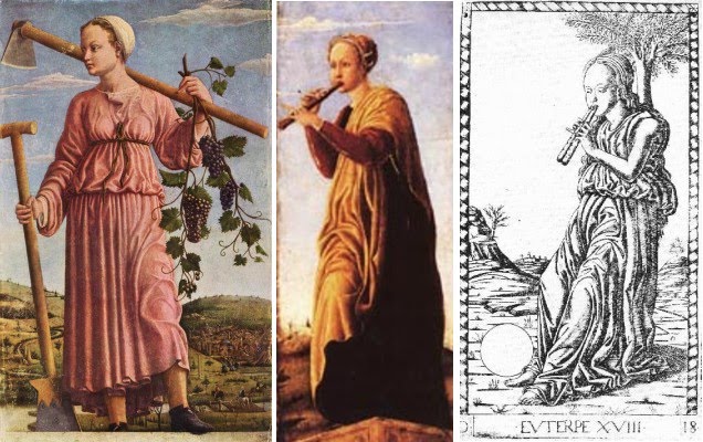
Art historians today agree, on good evidence, that the left-hand painting, now identified as the Muse Polyhymnia, was done for Leonello d'Este's studiola in his new Belfiore Palace, c. 1450. The other, Euterpe, is not much mentioned, but when it is (Gombosi, De Romanis), it is usually located at the same place. The palace and studiola were destroyed in one of Ferrara's disastrous earthquakes, probably that of 1593; but likely eight of the paintings are still extant, in various museums, with various histories, and in various styles. (A convenient website to see seven of them, lacking only the one on the left above, and with a good summary, is Allesandra De Romanis's http://www.italica.rai.it/rinascimento/parole_chiave/schede/belfiore.htm; I get it from a post of Marco's on another thread.) In several cases, as x-ray studies have confirmed, paintings in one style were painted over, partly or wholly, and redone in a different style. The repainting is in the style of Cosmé Tura, and so by him and perhaps an assistant in the late 1450's, probably at the request of Borso d'Este, who succeeded Leonello as Marquis of Ferrara.

Four of the Muse paintings received only minor retouching. One, sometimes identified as Thalia, was done by Michele Pannonio, signed by him, and in a different style than any of the others; it does not concern us here. The others are the two above and one more in the same style, shown below. These three are the only ones that have their Muses standing rather than sitting. For both reasons, some historians (Baxandall, Eorsi, Boskovits, all cited on p. 169 of Campbell 1997) have theorized that they were done for a different series of Muses. However the wood on the left-hand painting above is from the same log as three other Belfiore Muses, and it has the same type of white undercoating, done before the modifications (Dunkerton, pp. 108, 109, 114)

The paintings loosely follow a program for them written by Guarino da Verona, Leonello's old tutor (Campbell 1997, p. 31, with the Latin original on p. 169). The Malatesta Chapel in Rimini followed his program more precisely. A quotation from the program actually appears on one of the other Belfiore Muse paintings. In Guarino's program, Euterpe was Muse of the pipes, and Polyhymnia, Muse of crop cultivation. The Euterpe appears to have been had part of its left side removed, as it is narrower than most of the others, although exactly the same length. Probably the same is true of the third one, identified as Melpomene, having the same dimensions.

What happened to the three after the Belfiore? According to 19th-early 20th century art historian Adolfo Venturi (p. 29), the two narrow ones served as side-panels in a Bologna church, as "angel-musicians," in Venturi's phrase, and then resided in the collection of Marquis Nerio Malvezzi of that city. They are both now in the Fine Arts Museum of Budapest. The Polyhymnia has been in Berlin since at least the 19th century.

THE ARTIST


So who painted these three? The antiquarian merchant and traveler Ciriaco da Ancona, who visited Belfiore on July 13, 1449, said that of the 9 paintings commissioned, 2 were completed, Clio and Melpomene; he names the artist as Angelo Parrasio. Here is his description of Clio:
The former, conspicuous for her dress embroidered in purple and gold, and for her blue chlamys, holds in her right hand a trumpet, in her left an open book, and with a certain modest hilarity in her expressive face, and something of a glance of her eyes, seems to urge men on to glory (Venturi p. 28f).
This painting, although its description reminds me of a certain Vermeer (http://www.essentialvermeer.com/catalogue_xl/xl_art_of_painting.html), seems to have been lost. The "Mantegna's" Clio (at left, below) has something of the same mood, but with different accoutrements.
Image
And here is Ciriaco's description of the Melpomene:
Her shoulders covered by a purple robe, she lightly touches the strings of her harp, turns her rapt gaze towards Olympus, and with modest and grave enthusiasm tunes her songs to the harmony of her chords.
He also mentions flowers at Melpomene's feet, painted so realistically that they deceived the bees (he is repeating a standard phrase, probably deriving from a classical source such as Philostratus). The Budapest Melpomene painting (center above) seems to have the same robe and harp.

Oddly, Venturi did not identify this description of a Muse with the painting at all, but simply called it an "angel musician." Perhaps he considered it too great a departure from Ciriaco's description, because of the improbability of flowers, and because she does not appear to touch the strings. But these are fine points; Ciriaco was a merchant, a promoter of goods, albeit one who had been to Egypt and knew his antiquities. To her right above, I put the "Mantegna" Melpomene. Obviously we do not have a match. The engravings are the product of a different environment, either with a different patron or one who changed his mind. But the style is similar. I will elaborate further on this point later.

The painter, whom Ciriaco called Angelo Parrasio, is also known as Angelo Maccagnino; he came to Ferrara from Siena in 1447, and Leonello put him in charge of the Muses project. Georg Gombosi, writing in 1933, attributed the Euterpe and the Melpemone to him. More recently Jill Dunkerton (2002, p. 114) attributed the Polyhymnia to him as well. But most scholars today disagree: none of the three is in Angelo's style. Dying in 1456, he was already old in 1450, and painted in an older style, visible e.g. in the upper body of the Erato, while the others reflect a new style, like that of Piero della Francesco. Campbell attributes the Polyhymnia to "an anonymous artist influenced by Piero della Francesca (in Ferrara around 1450)" (1997, p. 33). In the caption to the painting he says "Ferrarese, c. 1450" (p. 35). He does not discuss the others, but De Romanis, in her web essay on the Muse paintings already cited, attributes all three to "anonymous Ferrarese" ("anonimo artista ferrarese" and "ugualmente di anonimo ferrarese"). Nicoletta Guidibaldi, in Prospettive di Iconografia Muisicale (in Google Books) uses the same words.

Adolpho Venturi claimed that the painter of all three was one Galasso Galassi (p. 30), also called Galasso di Matteo Piva (p. 24), whom he also held, because of stylistic similarity, was the originator of the "Mantegna" designs. Venturi's opinion was reaffirmed in 1954 by Gnudi, and earlier by Longhi according to Gnudi, in a critical notice excerpted by Trionfi (in the section "Artists active in the Studiola," http://trionfi.com/0/m/16/).

Gombosi, in his 1933 Burlington Magazine article (at http://trionfi.com/0/m/16/) took issue with Venturi. He attributed the Polyhymnia to Galasso but the other two to Angelo, despite the lack of similarity in overall composition and mood to the other Angelo Muses, the ones altered by Tura. (At http://www.italica.rai.it/rinascimento/parole_chiave/schede/belfiore.htm, compare Euterpe and Melpemone to Erato, Terpsichore, and Urania.) Gombosi based his attribution to Angelo on similarities to the other Angelo Muses in the depiction of folds in fabric, and on his identification of the landscape as Umbrian. However x-ray analysis since has revealed that the folds were put there later in the repainting (Dunkerton p. 116f); as for the landscape, it seems to me rather generic, easily learned from others' example. Gombosi noted the similarity in style of the Euterpe and Melpemone to the "Mantegna," to this extent following Venturi, and identified the cards as "Ferrarese (or Bolognese, but hardly Venetian)."

Galasso's name appears in one contemporary document, showing payment to Cosmé Tura and Galasso for appraising the value of some pennants done for the d'Este court in June 1451 (Venturi p. 29, Tyson p. 35). Tura was the artist in charge of painting over, in his style, all or part of some of the original paintings, all seated Muses: the unfinished Calliope completely, and three others, Erato, Urania, and Terpsichore partially (Dunkerton, pp. 108, 109, 114). So he and Galasso were in 1450 likely both students of Angelo, with similar ways of painting folds in fabric. But the three standing Muses are not in Tura's style. It is theoretically possible that he painted some of the originals in an early style and then painted over them later in a different style. But there is no documentation of Tura paintings suggesting that style.

Galasso's name next turns up in Vasari (Vol. 2, 1st edition only), who says that he was trained in Ferrara and then moved to Bologna at the invitation of "some Dominican monks" (p. 126), where he died at about age 50. According to Vasari's 1871 English translator, he lived 1438-1488. Venturi says he died in 1470 and that he worked for Bessarion, the papal legate in Bologna 1450-1455. Vasari's translator mentions another account of his life in a nineteenth century Italian source, which I have not consulted.

I have found only one recent art historian mentioning Galasso. Drogin, writing in 2002 of Bologna during the time of the Bentivoglio, says, "Piero della Francesca perhaps visited around 1450, followed by his student Galasso, to whom a 1455 Funeral of the Virgin is attributed (San Michele in Monte, destroyed 1831" (p. 80). Drogin does not give a reference.

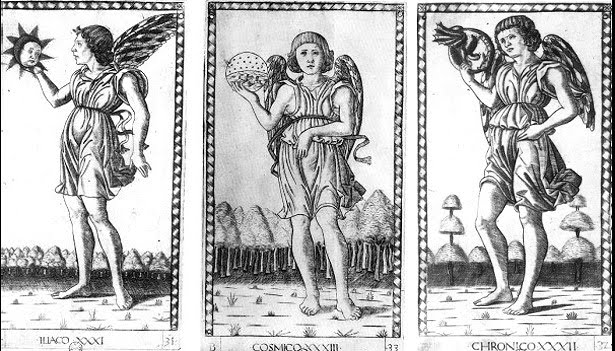
I have been focusing on just one of the 50 images in the "Mantegna." But all are in a similar style, if not in the same hand. (Lambert, p. 145, suggests a workshop, an "atelier." Lambert is conservator in the Departement des Estampes et de la Photographie at the Bibliotheque Nationale, and her book is a catalogue of that library’s holdings.) The Muses, Virtues, and Liberal Arts are especially similar, mostly standing figures in robes. Before the "Mantegna" images this style was not a common one: I have seen nothing quite like them, apart from the three standing Muses of Belfiore.

It is not unthinkable that Galasso took drawings of his three Muses with him to Bologna and with the help of humanists there, perhaps Bessarion himself, redid them and added more. One such humanist is a name that Trionfi mentions in their section, "Mantegna Tarocchi Engravers," for his interest in printers: Niccolo Perrati, Poet Laureate of Bologna in 1452 (the time of Frederick III's marriage journey), sometime secretary to Bessarion.

I wish to emphasize that the designs of all the figures need not have been Gelasso. Numerous artists, including miniaturists, came to Bologna during Bessarion's tenure as prelate and after.

In this new environment, with new designs, it is the style that continues, not the programmatic details. Admittedly, no professional art historian today makes Venturi's leap to Galasso and Bologna. Stephen Campbell says that the "Mantegna" was "devised by a Ferrarese artist and circulating by the 1460's" (2004, p. 127). Tyson agrees (p. 57), suggesting a candidate for the designer, Gherardo da Vicenza, the triumph-card maker, because his dates are right, because documents show that he designed other things for the Estensi, such as silverware, and because there are possible affinities between the cards and anonymous sections of the Schifanoia frescoes. To me that is not much of an argument for Gherardo in particular.The d'Este cards of c. 1473, to which he would be expected to have made some contribution, don't look a bit like the "Mantegna."

Hind, in his 1938 discusssion of the "Mantegna (p. 228),, mentioned several other painters of playing cards at the Ferrara court in the 1460s, besides Gherardo, who could have done the job:
Among painters specifically of playing cards at the same court are named Allesandro di Bartolommeo Quartesano, Don Domenico Messore, Giovanni di Lazaro, Cagnola, and an amateur named Petrecino of Florence, a paage of the Duke. But even if the designer of the engravings is to be found among such names, there is no clue to help us to fix on any one of them.
One reason that Campbell gives the 1460's rather than earlier, is his theory (2004, p. 126f) that several literary and artistic productions of that time, including the "Mantegna" and the Lazarelli poem, were reacting to the seductive, morally ambiguous nature of the Belfiore Muses, as they were in the late 1450's; they wished to present the Muses in a more elevated way. Whatever the merits of this argument, it applies only to the Tura repaintings, and not to the three unaltered ones. As far as a reaction against Tura's and del Cossa's style, the Schifanoia at least, 1469-71, in its most conspicuosu parts, the so-called "decan images", shows no such restraint. it seems to me that eople were capable of appreciating both styles, whether at the time of the Belfiore Muses or later.

In the captions to their reproductions of the cards, the art historians say "anonymous Ferrarese," meaning "anonymous painter from Ferrara," as opposed to "painter in Ferrara." This curiously not ruling out the possibility. Galasso was always a Ferrarese--as were many other painters who came to Bologna from Ferrara at one time or another..

THE ENGRAVINGS: A 1467 MANUSCRIPT IN BOLOGNA

I turn now to the engravings. Most painters did not have engraving skills. Engraving started in Germany in the 1430’s, per Wikipedia, but both Ferrara and Bologna had active engraving and printing communities in the 1450's and later, including, at least in Bologna, German shops. Lambert (p. 146) classifies the "Mantegna" as "burin proche de la maniere fine Florentine," which I translate as "burin close to the fine Florentine manner." "Burin" in English means the engraving tool; perhaps in French it means "engraving" as well. Indeed, the "Mantegna" engravings are technically similar to Florentine ones of the 1460's reproduced by Lambert. Others that she attributes to Ferrara and elsewhere she calls simply "burin," except for Florentine ones, which she calls "burin en maniere fine." (Looking at the reproductions, I can't see any difference among them.) At that time, the 1450's and 1460's, Florence was closely allied politically with Bologna, Bologna's leading citizen having grown up in Tuscany and Florence; but Ferrara was considered an enemy. Numerous Florentine craftsmen came to Bologna to build and decorate the palaces of the rich, a trend in which the leading family set a strong example (Ady, p. 150ff).

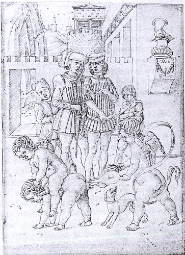
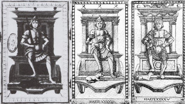
We do know that the next appearance of something similar to the "Mantegna's" imagery was in Bologna, in a 1467 miniature, of an Emperor and a Pope (Lambert p. 145 etc.). The miniature is posted by Trionfi at http://trionfi.com/i/mantegna-tarocchi/index2.php. I post the relevant section below, underneath three “Mantegna” cards. Trionfi observes, in their comments below the photo, that besides the Emperor and Pope is also a figure similar to the "Mantegna" Servant, "Il Fameio." I assume they mean the person at the far left of the Pope. So above the miniature, I put all three cards for comparison. The figure of the Servant is possibly repeated to the Pope's right; but the face and costume resembles more the Merchant. I also see the Chevalier behind and to the left of the Emperor, possibly repeated on his right. And there is a bearded version of the "Mantegna" King kneeling before the Emperor. I post these three below the miniature, for ease in making visual comparisons.
Image
Image
Image
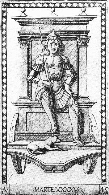
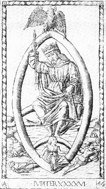
Possibly the four minor characters are stock figures of a generic nature. Lambert does not list them. The Emperor in the miniature is indisputably a close match with the "Mantegna" Emperor (and also the figure in its “Jupiter”: see http://trionfi.com/mantegna/e/e-mantegna-tarocchi/46.jpg). With the Pope there are some similarities, such as the tiara and the keys, but also some differences. His posture is different. The robe is more elaborate, filled with abstract designs. The face is different, too. So is the miniaturist's version a a more complex version of the card, but with a rounder face, or is the cardmaker's a simplification of the miniature, with a thinner face?

The posture can be explained by reference to the other side of the illustration, with the Emperor: the two figures are meant to complement each other. This explanation, while accounting for the difference, does not answer our question of which came first. The face and robe, I think, demand a more complex explanation, but one that may yield more interesting results.

We must first look at the "Mantegna" Pope card in the context of 15th century Popes. One of Trionfi's arguments for the engravings' late date, c. 1475, is a resemblance that they perceive between the "Mantegna" Pope and Sixtus IV, who became Pope in 1471 (http://trionfi.com/0/m/05/).

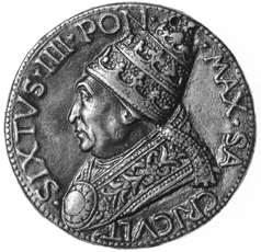
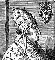
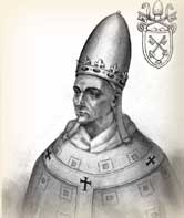
Admittedly, the man on the card is not similar to his predecessor, 1464-1474, Paul II, who reigned while relatively young and portly (for his portrait, scroll down about 4 images). But I am arguing that the cards started being designed in the 1450's, in the form of drawings; so we should also compare the card to the Popes then. There is also the element of the keys in the "Mantegna" Pope's hand. Nicholas V (1447-1455), the Pope who appointed Bessarion papal legate and let the Bolognese largely run their own affairs (Ady, p. 37), had just such keys as his personal device, frequently added in the corner of his portrait. Here is an example:
Image
To me the Pope card looks like him. And if not Nicholas V, there were two after him in the 1450's; even without the device, keys were associated with Popes. I cannot see how the Pope card looks more like Sixtus IV than any of these. Below are Callistus II (1455-1458) and Pius II (1458-1464),  (http://catholicsites.org/popes/renaissance.html), with the "Mantegna" in the middle.
Image
As I say, to me there is a good match to Nicholas V, the one I showed first, for whom the keys were a personal device, who reigned 1447-1455 and was much beloved by humanists for his sponsorship of the translation of Greek texts into Latin.
.
Now the strange result--well, not so strange--is that the Pope in the miniature does not look like any of the above, but rather like Paul II, the Pope from 1464 to 1471, whose likeness we see on the right below: (After writing this I found that Zucker, in The Illustrated Bartsch, Vol 24 Part 3, footnote p. 7, makes this same association. Also, he associates the Emperor to Theodosius.)
Image
So we can date the miniature to that period as indeed it is, 1467. But the card, based on this evidence, is likely either before or after that period. I of course think it was before. But at least we have an explanation of why the face is different.

As for the robe, it may be that Paul II wore such things. The portrait posted on Wikipedia (http://en.wikipedia.org/wiki/Pope_Paul_II) shows a golden robe with intricate designs. He was 47 when elected Pope and so may have lacked the austerity that often comes with age. He had been a merchant before changing careers when his uncle was elected Pope (in the end advancing from a lower “Condition of Life” to the highest.) And the late 1460's was a time for magnificence: Florence's Medici, Milan's Sforza, Bologna's Bentivoglio, Ferrara's Este, etc. Such a robe also gave the miniaturist a place to show off his skill. Moreover, the patterns themselves have an interesting characteristic, at the top and bottom of the double key that the Pope is holding in his right hand: the patterns merge with the key edges, so that someone might not recognize the key at first. It is a kind of visual double entendre, another way in which the miniaturist shows off his skill. For the pun and its reference to be appreciated, however, people would likely have to have been familiar with the card; Nicholas V and other popes were not shown actually holding the keys in the manner depicted.

So tentatively we can say that the manuscript came after the card, or at least the image on the card, i.e. before 1467.

REFERENCES NOT DETAILED IN POST OR LINKS

Ady, Cecilia, 1937. The Bentivoglios of Bologna.

Campbell, Stephen J., 1997. Cosmé Tura of Ferrara.

Campbell, Stephen J., 2004. The Cabinet of Eros: Renaissance Mythological Painting and the Studiola of Isabella d'Este. In Google Books.


Drogin, David, 2002. "Bologna's Bentivoglio Family and its Artists: Overview of a Quattrocento Court in the Making, in Artists at Court: Image-Making and Identity, 1300-1550, 2002, ed. Stephen Campbell, pp. 72-90.

Dunkerton, Jill, 2002. "Cosmé Tura's Painting technique," in Cosmé Ture: Painting and Design in Renaissance Ferrara, ed. Alan Chong, pp. 107-152.

Giovannoni, Giannino, 1981. Mantova e i tarocchi del Mantegna.


Lambert, Gisele, 1999. Les Premieres Gravures Italiennes: Quattrocento--Debut du Cinquecento.

Levenson, Oberhuber, and Sheehan 1973. Early Italian Engravings from the National Gallery of Art.

Seznec, Jean, trans. 1953. Survival of the Pagan Gods: The Mythological tradition and its Place in Renaissance Humanism and Art, trans. Sessions.

Skelton,

Syson, Luke, 2002. "Tura and the 'Minor Arts': The School of Ferrara," in Cosme Turé: Painting and Design in Renaissance Ferrara, ed. Alan Chong, pp. 31-70.

Vasari, Giorgio, 1871 translation of 1550 original. Lives of the Most Eminent Painters, Sculptors, and Architects. Vol. 2, translator Johnson, in Google Books.

Venturi, Adolfo, 1931. North Italian painting of the Quattrocento: Emilia.

2. 1468-1471, and pre-1465 Zoppo


1468: THE ST. GALEN MANUSCRIPT

Not only images from the "Mantegna", but actual engravings so similar they could be slightly earlier than the "Mantegna" itself, appear in a manuscript dated 28 November 1468. The four “Mantegna” cardinal virtue rngravings, of the same size and type as the cards, were inserted as miniatures in Foir di Virtu, a book on the virtues kept in the Benedictine monastery at Saint-Gallen, Switzerland, and completed 28 Nov. 1468. Trionfi has an image with the four pages superimposed on a "Mantegna" Prudence (http://trionfi.com/i/mantegna-tarocchi/index.php). Here is Lambert's description (p. 145)
...quatre tarots inserés dans son texte: La Tempérance, La Prudence, La Force et La Justice."L'écriture déborde sur les marges des estampes, ce qui prouve que celles-ci étaient en place antérieurement à la composition du manuscrit"
(...four tarot cards inserted in its text: Temperance, Prudence, Strength, and Justice. The writing overflows the margins of the prints, which proves that they were in place prior to the composition of the manuscript.)
The language of the book is German. Here is Trionfi's image of one of the pages, which clearly shows the writing overflowing the margin. "Huck," for Trionfi, says that the engraving, glued onto the page, appears to be by the same engraver as the card (http://forum.tarothistory.com/viewtopic.php?f=12&t=463&p=5955).
 Image
It is not identical to the card, however, because it lacks the animal in the background and the title at the bottom.
Image
Huck, speaking for Trionfi, says that the 1468 engravings were done by the German printer Sweynheim in Subiaco, near Rome, where he had set up a printing press to turn out books on papal commission in a Benedictine Monastary. He would have picked up the originals on which they were based--drawings, woodcuts, or poor quality engravings--in Venice on his way to Rome from Germany.  The St. Gallen Monastary is also Benedictine. So the one sent the engravings to the other.

Trionfi points to an observation by print specialist Arthur M. Hind, in 1948, that the engraving of the "tarocchi" is similar to that of a 1478 map based on the writings of Ptolemy put out by the Subiaco printing firm. Trionfi quotes Hind, in the context of the e-series:
On the other hand there is a close similarity between the present series and the engraved maps of the Ptolemy printed at Rome in 1478. The precise cutting of the maps and the representation of forests and hills are closely related in style. If the engraver of these maps is identified, some solution might be found, for the engraver of the so-called Tarocchi might have undertaken the work of the Roman printer.
(This quote is from p. 228 of Hind; I have added a comma before "found", and the hyphen in "so-called", which Trionfi omitted.) From this Trionfi concludes that the tarocchi were done in the period just before the Ptolemy, i.e. between 1473 and 1478, using copper plates engraved by Sweynheim before his death (which Trionfi says was sometime 1475-1477 (Hind on p. 189 argues that Sweynheim probably died in 1473-1474, as the last book in which Sweynheim's name appears as co-printer is 7 May 1473, after which Pannartz' name appears alone) .

But Hind argues just the opposite, in a clarification that comes after the passage Trionfi quotes. He says that probably the tarocchi were done in the North, i.e. Venice, and that Sweynheym, the printer, might have met him in Ferrara after the cards and brought him down to Rome. Here is the page. Hind has just been discussing another Ptolemy, which came out a year before the Subiaco one.
. Image

So Hind's "final suggestion" is that Sweynheim had met the engraver of the Tarocchi on his way from Germany in 1465 and recruited him later, in the 1470's to do the engravings of the Ptolemy, for which Sweynheim did the printing. Sweynheim, according to Hind, was a printer, not an engraver.

There are two distinctive features possessed by both the "Mantegna" and the 1478 Rome Ptolemy that lead Hind to his conclusion: first, the "purity and precision" of the engraving, "of both maps and lettering"; and second, "the symbolic representation of natural features, forests, and mountains."

Scholarly consensus now is that Hind was probably wrong in thinking that Sweynheim came to Italy in 1465 (just when the "Mantegna" happened to be published!). He probably came in 1462 or 1463 and set up his printing press in 1464. But this is a minor matter. Sweynheim could have learned about a Ferrarese--or Bolognese or Venetian--engraver from seeing the cards, either in Rome or being sent them from his fellow German printers in one of these cities, or from some other source, such as Lazarelli. "Hind's error," if there is an important one, is something else.

Hind's error, according to Trionfi, was in not knowing that the engraver of the 1478 Ptolemy was in fact either Sweynheim, who would have been engraving before his death in 1475-1477, or his "pupil" Buckinck. Huck, for Trionfi, says,
Hind comes in his analyses to the conclusion, that the "unknown" engraver of the Ptolemy maps, produced 1473 - 1478 in Rome, was likely also the engraver of the Mantegna Tarocchi. However, the engraver of the Ptolemy is not "unknown", generally it is assumed, that they were made either by Sweynheim or his "unknown pupil" Arnold Bucking.
But was Hind really wrong? Where is it "generally assumed" that Sweynheim was an engraver, who then taught Buckinck? What is the argument? Tony Campbell, Map Librarian at the British Library, says in the course of discussing the letter punches:
Skelton has shown that Sweynheym developed the technique [of punches] during preparation of the maps for the 1478 Rome Ptolemy, since the three years Sweynheym spent giving 'instruction in the method of printing from copper plates' were unlikely to hve been concerned with engraving, about which he could have had little specialized knowledge. Skelton's persuasive interpretation is that Sweynheym was referring to what seems to have been a double achievement: the development of a practical alternative to handcut lettering and an improvement in the strength and consistency of the impression taken from the finished plates.((The Earliest Printed Maps: 1472-1500, 1987, p. 223f).
If Sweynheym wasn't an engraver, then he couldn't have taught Buckinck. Buckinck was most likely a printer like Sweynheim. The engraver remains unknown.

Campbell's reference is to Raleigh Skelton, a printing historian who probably knew, when he was alive, as much about Sweynheim as anyone else in his day. He edited the 1966 Amsterdam facsimile edition of the Rome Ptolemy; in its Introduction is the "persuasitve argument" to which Campbell refers. The argument takes him a couple of pages to present. I will do my best, but it will have to be in another post, because I want to get it right and think about it, too.

Huck, speaking for Trionfi, says that the identity of the engraver isn't really that important. It's the result that matters (http://forum.tarothistory.com/viewtopic.php?f=12&t=463&p=6130). To be sure, I cannot disagree. He also suggests (same post) that "it is not impossible" Sweynheim was in fact the same person a famous German  master card maker, "master of the playing cards", who worked with Gutenberg and then disappeared around the same time that we start hearing about Sweynheim I would only comment that according to Huck the disappearance was sometime between 1450 and 1465, and that this "master" might have been more than one person. The large date range reduces the likelihood of a significant coincidence. Life was precarious then; the master might simply have died or become incapacitated.
.
Whoever the engraver was, it seems to me there is a simpler explanation for how the engraving got to St. Gallen than to suppose Sweynheim picked up the requisite drawings on his way to Rome and then had the engravings made. There were Benedictine monasteries near most large cities in Italy at that time. It could have come from any of them, having been instructed by brethren in St. Gallen to look for engravings of the virtues.. In particular, there was a Benectine monastery near Boogna which was actively engaged in producing illuminated manuscripts. We know this from Kurt Barstow, The Gualengi-d'Este Hours,  who gives us information about the principal illuminators of that masterful work, Crivelli and dei Rossi. Crivelli's first recorded work was for the Benedictines of San Procolo "working on initials for choir books" ( p. 32). He pawned the parchment, and it was retrieved by the monks! Crivelli's misadventure at least shows that there was an active Benedictine manuscript-making industry in Bologna then.

So did Crivelli design, and perhaps even engrave, the "Mantegna"? There is no evidence of his engraving anything, despite his involvement with the poorly engraved Bologna Ptolemy maps of 1477.. On these maps, The many ornamental features in and around them, such as fish, boats, and water (all added after the first prints), suggest someone with the pictorial eye of an illuminator. And the heads representing the winds (two shown below), surrounding the large map on all sides, are in the style of Crivelli's illuminations of saints.
 Image
Hind observed that these heads, despite the roughness of the engraving, are in "the true Ferrarese style" (1938, p. 290). Since all these features were added after the maps were done, it is an open question whether Crivelli engraved the maps.

But if Crivelli was involved with the "Mantegna," it would have to have been at some time when he was not deeply involved in book illumination. He is known to have finished one series in 1465, another in 1467, another c. 1469, another in 1470. and another in about 1469 or 1470 (Barstow p. 32).  When did he have time to design the "Mantegna"?

It may be significant that of the small number of saints for which the 1469-1470 Gualengi-d'Este Hours has illuminations, two (both done by a different illuminator, Guglielmo Giraldi) were from Bologna: Catherine of Bologna (who wasn't canonized until the 18th century) and the exceedingly obscure and unofficial St. Ossanus.Both were done by a different illuminator, Guglielmo Giraldi. I know nothing of his work besides these two pieces.

So by 1468 we have 4 virtues and 6 Conditions of Life.Where there are four Virtues, there are probably three more. Where there are 6 Conditions of Life, there are probably more. The PMB tarot already had its Fool resembling the “Mantegna” Misero and a Bagatto resembling the Artisano. By 1468 we already have close to the 20 cards of the “Mantegna’s” 50. And the ‘Pope” card refers us to pre-1464 and even the time of Nicholas V, 1447-1455. In addition, the Belfiore 3 standing Muses account for the design of most of the Muses, Liberal Arts, and Virtues, as standing male or female figures in robes. All that is left are the Spheres, stock representations of the planetary gods.

THE "MANTEGNA" AND THE SCHIFANOIA PALACE

Lambert, following Hind, simply suggests "vers 1465" (p. 145: "around 1465") in Ferrara. Her argument, besides the 1467, 1468, and 1471 manuscripts, is a tylistic similarity to the frescoes of the Schifanoia generally. It would take me too long for me to compare the cards to the Schifanoia here. Historians writing in Italian and English say that many artists were involved; some, it seems to me, may even not have been resident in Ferrara, because Borso wanted the job done quickly.
Image
Different historians have found resemblances to different sections. Gnudi argues, in the excerpt posted by Trionfi (“Artists active in the studiola”), for a resemblance to the December "Triumph of Vesta." Gnudi, Trionfi says, was in charge of the restoration. I have not found a post-restoration reproduction of this scene; all I have is a drawing done a century or so ago (in Roettgen, Italian Frescoes: the Early Renaissance, p. 414) It is of a quite deteriorated fresco, one that looks to me rather generic Northern Italian.

Tyson (p. 59f) sees resemblances to some very different figures in the June, July, August, and September sections, both men and women, in the middle and lower upper parts. To me these all look either too inventive and energetic for the cards or again generic. On the other hand, the cards are close enough to these images that they could have been used by the painters in preparation for their work, since the Schifanoia was done 1469-1471, presumably after the cards. I invite the reader to inspect the frescoes on the Web..

Zucker sees resemblances in the April, May, and June frescoes, the ones done by del Cossa and assistants. These seem to me more promising parallels. From Roettgen's reproductions in Italian Frescoes: the Early Renaissance, this is what I see. First the Merchant, from March and April. I can't tell whether the April merchants, on the right, are reading anything. August, not shown, has similarly dressed merchants, but clearly not reading.
Image
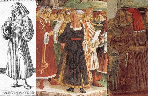
Next, the Gentleman, both selections from April.
Image
I suppose that some of the men around the March merchants would count as Gentlemen, but both pose and dress are somewhat different.

For the Knight, I found these in March and April. They don't have swords, but their costumes and pose are similar:
Image
Zucker also finds resemblances at the Schifanoia to Apollo and the Muses: "With some justification, Cieri Via has compared the figure in the engraving [Thalia--msh] to that of Aurora on the chariot of Apollo in one of the frescoes of the Pallazo Schifanoia" (p. 26). And he notes Apollo's attribute of the swan in the "Mantegna" is also at Palazzo Schifanoia (p. 30). I do see the resemblance between Thalia and Aurora, and Apollo's swan (above him, at left below). I also see something else, a resemblance between the Schifanoia's Apollo and the "Mantegna"'s "Genius of the Sun":
ImageI also see Thalia on the April wall, sitting on the ground, while above her Euterpe and Terpshicore are standing, holding their instruments:
Image

Zucker says that "Clio's swans compare to Triumph of Venus at Schifanoia" (p. 29). Here they are:

Image

The resemblance isn't precise, but why not?

And finally, as Huck pointed out, all nine Muses are in the May fresco to the right of Apollo. There is not much there to suggest the "Mantegna" here except the two instruments, which correspond in the "Mantegna" to Calliope's long trumpet, and Terpsicore's lute. But Terpsicore's face has been transferred to the Muse on her right. A relationship to the "Mantegna" is strongly suggested, even though Terpsicore's instrument is a little different, because instruments were not depicted with Calliope and Terpsicore in Borso d'Este's Muse series at Belfiore (see http://it.wikipedia.org/wiki/Studiolo_di_Belfiore).
Image

Image
To sum up: the resemblances I have been able to find correspond to are 4, 5, and 6 of the Conditions of Man and 11, 13, 16, and 18 of the Muses, and 31 in the three "genii" added to the Virtues series.

As I say, all of these images are in March, April, and May, the three months done by del Cossa and assistants (although somewhat similar figuress occur in August and elsewhere). No art historian that I know of has proposed del Cossa as the designer of the "Mantegna." They mostly use the resemblances to say that the "Mantegna" was Ferrarese. But if the artist was't the same,
the Schifanoia artist, or cartoon-maker for the designs, could simply have used the "Mantegna" engravings for inspiration.
 
THE "MANTEGNA" IN THE CONTEXT OF ITS INFLUENCES AND WHAT IT INFLUENCED

Levenson et al have interesting things to say about the individual cards. They notice the similarity between the Servant and the PMB Pages of Coins. Iliaco is also similar to the Page of Coins, and there is some similarity betwen Cosmico and the PMB World card. The Artisan is similar a scene in Baldini's Planet Mercury, which I show below. Oddly enough, the standing figure at the right is rather similar to the Servant.
Image
For the Gentleman, they note a comparable hunting scene in Baldini's Jupiter. The King is similar to the Kings of Coins and Staves in the PMB. The Emperor is somewhat similar to the PMB Emperor, and similarly for the Pope.

On the Muses, they note that the globes derive from Capella (the musical instruments do, too). Here is Levenson et al, p. 100
The most curious details in this group of images are the blank discs which appear with all the Muses except Thalia. According to Jean Seznec, they are meant to represent the celestial spheres of the Ptolemaic universe. Martianus Capella had assigned a sphere to each of the Muses, but since there were nine Muses and only eight suitable celestial spheres (the planets, the sun and moon, and the fixed stars), he placed Thalia on earth, so that the number would coincide (Seznec, p. 141).
 The authors of the National Gallery book also give us an engraving with very similar trees to those of the three cosmic powers in the "Mantegna," leading them to say that the engraver was the same (p. 88). It is housed in the Albertina, Vienna:
Image

These trees were one of the features that led Hind to identify the "Mantegna's" engraver with that of the 1478 Ptolemy. But who is he? The National Gallery authors reproduce a drawing that is like the engraving but without the trees (p. 88, not posted here; it is in the Gabinatto Nazionale delle Stampe, Rome).  But they do show us another engraving (p. 158) that seems also to have copied the putti we have just seen. They call this engraving "Ferrarese," but for no stated reason, other than that its putti resemble those in the first engraving, which resembles the "Mantegna" in its trees. This engraving is initialed "F.B." They suspect that it is a niello made from a plate that was not originally intended to produce prints. ("F.B." we learn, stands for "Francia Bolognese," the leading engraver of Bologna in the last quarter of the 15th century.)
Image
 They mention but do not reproduce another engraving which they say is also by the same engraver as the "Mantegna," a Death of Orpheus. Here it is, from Hind.
Image
 I will discuss this engraving more later.

For the planets, they note that the specific imagery of Mercury, Venus, Mars, Jupiter, and Saturn comes from the Libellus de maginibus deorum, an anonymous work of c. 1410-1420 . Their source is Hans Liebeschutz, Fulgentius Metaforalis(Studien der Bibliothek Warburg 4), Leipzig & Berlin, 1926, p. 118. Fulgentius was an early Christian moralizer of the Greco-Roman gods, as interpreted by a medieval writer. According to Seznec, Survival of the Pagan Gods,  the author is one Albricus, called Albricus or Albericus Londonensis or Philosophicus and also Alexander Nequam. Huck game me this link: http://books.google.com/books?id=YOISgW ... us&f=false. There were also illustrations.

On Mercury, we read, among other things
...In his presence there was also a cock, specially consecrated to him; on his other side was Argus, whose head and face were full of eyes, who lay decapitated by him.
And so we have:

They add that the "Mantegna" image also borrows from "an archaistic relief of Hermes that Cyriacus of Ancona copied on his trip to Greece," according to Fritz Saxl, "Riniscimento dell'Antichita," Repertorium fur Kunstgeschichte 43, 1922, pp. 252ff, and Seznec, Survival of the Pagan Gods, 1953, p 200f (see prevous link, which has p. 201).

Here is the one on Venus:
Venus was depicted as a very lovely girl, nude and bathing in the sea. In her right hand she holds a sea shell..,.she is accompanied by doves flying around her...and in her presence stand three nude young girls, who are called the three Graces. Two of them have their faces turned towards us, but the third, on the contrary, turns her back. And here stands Cupid, her son, winged and blind, who shot Apollo with the bow and arrow he holds.
So we see:
 
The convention was for the one turning her back to be the one in the middle. I will give a model a little later for the present arrangement.

The one for Mars is as follows:
It is said that Mars is the third of the gods, and he is third in the order of the planets....his figure was of a man raging, seated in a chariot, clad in mail and armed with other offensive and defensive weapons; he had a helmet on his head...and was girded with a sword....Before him a wolf carrying a sheep was depicted, as that animal had been specially consecrated to Mars by the ancients.
Thus:

Our engraver seems to have decided to leave off the sheep and to stick to just one weapon.. Levenson notes that the S-series substituted a dog for the wolf, thus showing that the engraver did not know the E-series source.

And here is Jupiter:
Jupiter, son of Saturn, to whom the rule of the heavens was given in the oracle, was depicted seated in an ivory throne, in his seat of majesty, holding the scepter of rule in his left hand. Frm the other, that is the right, he hurls thunderbolts downwards, keeping the Titans in check with his thunder and treading them beneath his feet. Together with him is his eagle, which, flyiing, carries beneath his feet the very beautiful youth, Ganymede., whom he abducted; the latter has in hand a crater, to fill Jove's goblet.

The engraver has obviously departed from this description, in favor of more amorous references. Also, its Jupiter, unlike in the Libellus, is not seated on an ivory throne, but rather on a rainbow, an image which comes from 14th century illustrations of Ovid, Levenson et al say.

Finally, of Saturn it says:
He was depicted as an old man, gray-haired, with a long beard, stoooped, melancholy, and pallid, his head covered...he holds a sickle, and in the same hand he carries the image of a serpent which bites its own tail with its teeth. With the other, that is, the left, he brings a very small child to his mouth, and appears to devour him. Near him he has his children, that is, Jove, Juno, Neptune, and Pluto, of whom Jupiter castrated him.

The image is quite close to the description.

Regarding these texts, I don't know how we would tell whether they were accessible to one rather than another of Sweynheim's circle in Rome, the humanists of Bologna , or those of Ferrara or Florence. The similarities to Baldini suggest an engraver from that workshop in Florence-- and Florentine engraver/goldsmiths were more likely to be working in Bologna than Ferrara.

Besides Levenson et al, the other major commentator on the "Mantegna" in English is Mark Zucker, in The Illustrated Bartsch, Vol 24 Part 3, to which I have referred.y.

Page 4-5: He says that the prints have "precise contours and fine rectilinear crosshatching, technical properties suggesting northeastern Italy rather than Florence, where contemporary Fine-Manner-engraving was far less disciplined and meticulous." [I don't agree with respect to Rosselli's early work.] He observes that "instead of deep, rich blacks, one tends to find subtle delicate grays resulting from the use of a variety of different-colored inks." He says that "within the field of fifteenth century Italian engraving" the E-series' "elegant craftsmanship is unsurpassed."

Page 6: about the E-series:
Only a single state is known, and there are no impressions showing later rework to the plates. All known impressions show small circular marks at the four corners of the decorative orders, signs of holes resulting from the plates' having been nailed down or riveted to, and then removed from a (wooden?) support prior to the process of printing. Such marks do not appear on any impressions of the S-series, but they are exceedingly common in niello prints and not uncommon in early Italian engravings generally; their significance remains somewhat conjectural.
...
Impressions Printed in Colored Ink. Many impressions of the E-Series are printed in inks of a color other than pure black or grayish black--for example, the sets noted above in London, Naples, Paris BN, Paris CR, Pavia, and Vienna, which include such tones as light bluish (Paris CR), greenish (Naples, Pavia, light bluish green (London), and light greenish brown (Paris BN).
Pp. 9-19, Conditions of Man. Comparisons to the genuine tarocchi, especially the PMB (for Beggar, Servant, Artisan, Knight, King, Emperor, Pope) and occasionally Sola-Busca (Servant, Knight, King). Gentleman compares to two "falconer cards" in Dummett 1980 pp. 73-74; and to Marco Zoppo's Parchment Book of Drawings (Ruhmer Marco Zoppo 1966, figs. 88, 90, 91, 105).


p. 24: Donati saw a connection of Erato to the tambourine-playing angel in Raphael's early altarpiece of the Coronation of the Virgin, now in the Vatican Pinacoteca, but "the figures are only similar in a general way, and a direct connection is highly unlikely."

p. 26: Thalia is also on the ground covered with vegetation at Tempio Malatestiano.

p. 27. "Melpomene's resemblance to figures of trumpeting angels in Last Judgment scenes was rightly noted by Westfehling."

p. 30. Apollo's attribute of swan at Tempio Malatestiano.

PP. 31-41. Liberal Arts. Main source is Capella's De nuptis, as was usual until the High Renaissance (except Poetry, not in Capella). The pictures compare to descriptions in Art du blason, except for Astrology and Theology, and "show unequivocally" that it "corresponds to the E-series rather than the S-series." (My comment: The Art du blason, once thought to be 15th century,  is dated to 1531

p. 33. Notes engraver's propensity to replace traditional serpents with dragons, in Logica and also Chronico, Prudence, Mercury and Saturn.

P. 38: source for Poetry seems to be various aspects of his own Muses.

PP. 42-50: Genii and Virtues. P. 42: No visual precedents for Genii except the tarocchi, "which frequently served as a visual source material for the series as a whole." Iliaco, from the Greek Heliakos--personifies the Spirit or Genius of the Sun, or of light." Trees compare to trees in background of PMB Knave of Coins, as well as cards shown in Kaplan vol. 1 pp. 104 and 105. [These are the PMB-style Victoria and Albert cards, undoubtedly he means the Star and the Pagte of Coins. On p. 105 it is the Andrioletti Pagte of Coins. I hadn't noticed this. Here they are (V&A in center column), with comparable trees in the "Mantegna" and the "Cupids":
Image

P. 43. Chronico, Genius of Time. Again, a dragon instead of a serpent. Notes that Baldini also changed serpent to dragon in his Aaron, and Rosselli in his Moses on Mount Sinai. Thematic relationship to Hermit in tarocchi.

p. 44. Cosmico, genius of the world. Thematic relationship to World card in tarocchi.

pp. 45-50. Temperance. Why the animal, an ermine, symbol of purity or chastity, should be looking in a mirror has not been satisfactorily explained. Temperance, Justice, and Fortitude are all related to tarocchi, although in Fortitude's case not to the PMB.

pp. 51-61. Planets and spheres. Planets all use traditional images. The three spheres come from Dante's Convivio, although not described there in a way that lends itself to images. Zucker comfirms relationship observed by Levenson between the “Mantegna” and the Libellus.

P. 52: The water on the card is one of Luna's attributes; compare to Baldini's Luna in his Planets series.

p. 53: Pose and costume of Mercury reflect "a Hellenistic relief transmitted to fifteenth century Italian artists via a drawing by Cyriacus of Ancona (ill. Saxl, fig. 21; see also Seznec citing other Renaissance examples)."

p. 54. Venus compares to Star in later tarocchi. Also this:
Partial copies of the engraving, unrecorded by Hind, may also be noted on the frontispiece of a Livy manuscript in the Vatican Library (MS Borghes, Lat. 368; see Rathe, “Sulla classificazione di alcuni incunabili calcografici italiani,” Maso Finiguerra 5, 1940, p. 6-7 and fig. 2); and on a Venetian glass chalice of ca. 1475 in the Cleveland Museum of Art (Venice, p. 74, no. 64), the other side of which has a partial copy of an unrelated early Florentine engraving, The Peddler Robbed by Apes, either TIB 2405.047 or 2405.048).
P. 55. Sun: The winged figure, not traditionally male, may be Aurora. "The scorpion, placed emblematically in the sky above the horses, is also an element in the legend of Phaeton (Hall, Dictionary of Subjects and Symbols in Art, rev. ed., 1979, pp. 243-44, 275)."

P. 56. Mars. Absence of a sheep shows that engraver had no direct knowledge of the Libellus, "although he was certainly familiar with the tradition it exemplifies." (My comment: he might simply have schose to leave it out..) Compares to King of Swords in PMB and Chariot of various packs. "Comparison may also be made with a miniature painting by Marco Zoppo showing Mars on a Triumphal chariot n a Virgil manuscript of the early 1460s (see Alexander, ”A Virgil Illuminated by Marco Zoppo Burlington Magazine 111, pp. 514-517, 1969, fig. 40). (I will show this later.)

p. 57. Similar mandorla with a rainbow is in Francesco del Cossa's panel of St. Vincent Ferrer, now in the National Gallery of London (Ruhmer, Francesco del Cossa 1959 pl. 69).

P. 59. Eighth sphere: figure similar to Muses. Arc of orbit also appears in engraver's depictions of planets.

p. 60: no visual precedents for Primo Mobile. [Zucker translates this as "Prime Mover," it actually means "First Moved"?]

p. 61. Prima Causa. Conventional medieval image of the Universe, with 13th century Sphera mundi of Johannes Sacrobosoco as the "most widely read [and illustrated] source for this universal paradigm" (Dixon, Giovanni di Paolo’s Cosmology,” Art Bulletin 67, 1986, pp. 604-613, p. 606.

hen there are the two other engravings identified by Levenson as by the same Master, the "Cupids at the Vintage" and "Death of Orpheus." I've already posted images of them. Of the first, Zucker (p. 157) notices the similarities to the trees in the three genii (already noticed by Levenson) and also
between the awkward foreshortening of the child Phaeton, tumbling through the sky in The Sun, and the equally awkward foreshortening of two cupids in the foreground here. In addition, the fine rectilinear crosshatching of the engraving is precisely comparable to the technique of the Tarocchi (p. 157).
Here are the images.

Image
Zucker's most interesting comment is about its dating:
"...there is a partial, unreversed copy of the print in a manuscript of 1466 (see Rathe, Kurt, "Sulla classificazione di alcuni incunabili calcografici italini," Maso Fineguerra 5, pp. 3-13).
Zucker ends,
No doubt some classical model or models lie behind all four of the fifteenth-century prints, although none of them corresponds in any detail to surviving classical examples.
I have already referred to one that does, at the Getty in Malibu.

On the "Death of Orpheus" (p. 155f), Zucker observes that it, like the "Mantegna" itself, was originally thought to be Florentine. But since the artist is clearly the same as the "Mantegna," it must be from Ferrara, Zucker argues. Orpheus in that pose is found in classical art (Warburg, Gesammelte Schriften 1932, figs 99-100 facing p. 446). In the Renaissance, it is in the engraving of Hercules and the Giants, after Pollaiuolo. For Pollaiuolo's own versions, see Ettlinger, Antonio and Piero Pallaiuolo 1978 pls. 88, 105. The complete composition is present in several examples: The Death of Pentheus, in Zoppo's Parchment book of Drawings (Ruhmer Marco Zoppo1966, pp. 77-81, fig. 98). The city on the hill corresponds in the same book to fig. 99 of Ruhmer. More closely related is the early Duerer drawing, Death of Orpheus, but with a different landscape and musical instrument. But the design itself did not originate with the "Mantegna," but in some lost work of another. Pollaiuolo is posited by Armstrong, Paintings and Drawings of Marco Zoppo 1976, p. 278ff; but most historians, including Zucker, favor Mantegna.
If nothing else, the character of the landscape is Mantegnesqu3e to the core, and Roessler-Friedenthal ("Ein Portraet Andrea Mantegnas als Alter Orpheus im Kontext seiner Selbstdarsellungen," Roemisches Jahrburch der Bibliotheca Hertziana 31, pp. 149-185) has recently contended that the head of Orpheus in Duerer's drawing (but not in the Ferrara print) faithfully preserves a self-portrait of the young Mantegna.
We will look some more at Zoppo. He was from Bologna. I see that pre-1465, Zucker notices a lot of Florentine comparisons, as I do. The Ferrara ones are all post-1465. So I still don't see why the "Mantegna" artist couldn't be a Florentine working further north, c. 1465.

MORE ON MARCO ZOPPO  

Here is the Zoppo's Triumph of Mars that Alexander writes about in Burlington Magazine 1969, pp. 514ff. It's done with purple dye, Alexander says.
Image

The relevant paragraph in Alexander's article is the last:
The scribe of the Virgil is probably Antonio Tophio. His coloured epigraphic capitals and fine Roman hand belong to the same current of Paduan humanism as does the now famous script of Bartolomeo Sanvino. Since Tophio was probably of an older generation than Sanvino, he may have been his predecessor. Another manuscript, signed by Tophio and with the same arms, was certainly decorated by the same artist and is adated 1463. Topho was in Rome in 1466. Probably he went there to work for the Venetian Pope, Paul II, for whom he wrote a manuscript in 1469. The probability is therefore that the Virgil was completed in Venice in the early 1460s. (Zoppo is documented in Venice in 1461 and 1462.)
By "the same arms," Alexander means "the arms of Morosini of Venice, argent a bend azure," which appears on the first page of the present manuscipt. The Triumph of Mars is one of three, in addition to the first page already referred to; it is the frontispiece to the Aeneid. The others are an Orpheus charming the bests, frontispiece to the Eclogues, and a Bacchus and Ceres, frontispiece to the Georgics. Of all of these, Alexander says, "Though intensely classical in feeling and in detail, I cannot find that any of these miniatures is based on specific antique prototypes."

In a footnote Alexander says, "The figure of Mars shows a general similarity to the Mars in the 'E's series of so-called 'Instructive Prints' or 'Mantegna Tarocchi.' There are also footnotes documenting the premises to his argument, which I can cite if needed.
There is more about Zoppo in the catalogue book Padua in the 1450s: Marco Zoppo and his Contemporaries, 1998, by Hugo Chapman for the British Museum. It is the most recent thing I could find on Zoppo--actually, so far the only thing within 500 miles of me. It will take a while before I get reproductions of some of the things that Zucker compared to the "Mantegna" series. But I do have a few rather poor reproductions to post, from the copy machine. First, here is one of the Zoppo drawings from his Parchment Book (also called the Rosebery album), c. 1455-1465 (Padua in the 1450's p. 66), that Zucker compared to the Gentleman.Image
The "homosexual imagery" in the scene with the putti leads Chapman to say that the series was a "private commission" (p. 38). He adds, same page:
Zpppa's witty and slighty irreverent references to antiquity, such as the enormous foot on a pedestal onin the background of the drawing of the putti playing with the bellows, suggest that the patron might have belonged to the sophisticated literary and humanist circles of either Padua or Venice.
If all but the section that compares to the "Mantegna" is removed, and beneath it are put both the "Gentleman" and the "Cavalier" from the "Mantegna," I think we can see some similarity.
Image
Image
The compositional technique of having a boy (other than putti) next to the adults is also used in the "Mantegna" figures.

And here is the "Death of Pentheus" that Zucker compared to the "Death of Orpheus" that he determined is by the same artist as the "Mantegna." Below it I have put the "Orpheus," for comparison (disregard the difference in reproduction quality).
Image

Image
Again there is a clear resemblance.

Against Zoppo Huck rightly observed that there were usually numerous putti in Zoppo's works. In the "Mantegna", however, putti are present in only two of the designs, Rhetorica and Prudencia (http://forum.tarothistory.com/viewtopic.php?f=12&t=463&p=6541).

The other engraving that Zucker and Levenson found similar to the "Mantegna," as I mentioned earlier, is one of putti in a grape harvest. Here it is again, so you don't have to flip back to my earlier section.
Image
Levenson (p. 158)saw that engraving's imagery reflected in a later engraving (c. 1475-1500), perhaps a niello, the background of which reflects several in the "Mantegna."
Image
Levenson calls this one "Ferrarese" with a question mark. It is unsigned, but there are the initials "F.B." at the bottom, in reverse. Zucker mentions one possibility for these initials that has been suggested: Francia Bolognese, one form of the signature of Bologna's first known major engraver, exclusively niello until late in life as far as I can determine; he was also a goldsmith. That the initials are reversed suggests that the plate was not originally intended to be printed, Levenson points out. That the derivative work is by a Bolognese is one more piece of evidence that the original was from the same city.

Now I will get back to Zoppo's Parchment Book. Here is another drawing from the series, and the "Mantegna's" Venus alongside it. Zucker seems to have missed this one.
Image
The "Mantegna's" graces are unusual in that they don't have the one on the sides facing in the totally opposite direction than the one in the middle. Instead, they are at a ninety degree angle to her. Perhaps this is because the compositon borrows from the Zoppo. Besides the figures and the composition, the trees are also interesting. True, the nymphs' faces are bit eccentric compared to those of "Venus," but they were for a different audience, elite vs. ordinary.

Here is another drawing from the same set:
Image

The trees are quite remniscent of those behind the three genii, especially if you consider that Zoppo might just have been the designer, not the engraver.
Image
So Zoppo is pretty interesting. Why couldn't he have been a designer of the "Mantegna"? There is no evidence that he did engravings, although engravers and illuminators oftendidn't sign their work. But the engraver of the "Mantegna" was too good to be doing engraving as an occasional sideline. From the records of his training--Gothic painting in Bologna and Squarcione's studio in Padua (recounted by Chapman)--there is no evidence of such training, or anything in metalwork. Hind thought the "Mantegna" engraver was Venetian, based mainly, I think, on the workmanship of the 1470 engraving of the pope and the emperor. Zoppo certainly had Venetian connections. His drawings, with their slanted parallel lines as shading, are very similar to how engraving of that time looks. Their 16th century owner in fact did engrave them in the 16th century, according to Zucker. In their shading, the only thing in the "Mantegna" that is missing from Zoppo's drawings is cross-hatching, which, as I showed earlier, is a prominent feature of Rosselli's engraving work in Florence of the mid-1460's.

There are a couple of other things of interest in Padua in the 1450s, pertaining to Zoppo's "Triumph of Mars." Alexander said in his article that in 1461-1462, the time he thought that Zoppo did the "Mars" and three other Virgil illuminations, Zoppo was in Venice. Here again is Alexander:
Another manuscript, signed by Tophio and with the same arms [of the Venetian patron, Morosino--mh], was certainly done by the same artist and is dated 1463. Probably he went there to work for the Venetian Pope, Paul II, for whom he wrote a manuscript in 1469/1470. The probability is, therefore, that the Virgil was completed in Venice in the early 1460's (Zoppo is documented in Venice in 1461 and 1462).
Alexander footnotes all three of these sentences with documentation. That Zoppo was in Venice 1461-62 certainly needed a footnote! However the footnote for that sentence is just some added thoughts that have nothing to do with Zoppo's whereabouts in 1461-62. In fact, according to Chapman, Zoppo is well documented as being in Bologna at that time. Another apparent error of Alexander's is the identification of the scribe and date: Chapman says that the scribe of both the works that Alexander attributes to Trophio was Bartolomeo Sanvito, and that the Virgil was probably done c. 1464 rather than 1461-62( p. 32f).

These errors make little difference for Alexander's conclusion. Zoppo was friends with Sanvito in Padua, where Zoppo lived 1451-1455, and probably also in Venice, where Zoppo moved in October 1455 (Chapman p. 28). Trophio was Sanvito's teacher, and both scribes had the "fine Roman hand" that indicates "the same current of Paduan humanism," as Alexander put it. Illuminators often lived in different cities from their patrons. But Zoppo's whereabouts does make some difference in the matter of the "Mantegna."

Here is what Chapman says (pp. 31-33):
Nothing is known of Zoppo's activities after his departure from Padua by October 1455 until 1461, when he is known to have been in Bologna. His presence in the city is documented by a series of payments for decorative work in San Petronio dating from 1461-2. In the city he painted two works, both of which are still in situ: the Crucifix painted for the church of San Giuseppe, and a polyptych for San Clemente, the chapel of the Collegio di Spagna...
...
It is not known when Zoppo left Bologna but it must post-date September 1462, when he wrote a letter from the city to the Marchesa of Mantua in relation to a commission for two pairs of cassoni. One of the excuses he offers for not having completed the work on time is that he wants them to be worthy of comparison with the work of his friend Mantegna, who two years earlier had gone to serve the Gonzaga in Mantua. Zoppo is next recorded in Venice, where in 1468 he executed an altarpiece for the church of Santa Giustina.
...
In 1471 Zoppo painted the high altarpiece for the recently constructed church of San Giovanni Batista in Pesaro. The building had been commissioned by the lord of Pesaro, Alessandro Sforza, and it is likely that Zoppo was his choice....From the period between 1471 until the artist's death in Venice seven years later there are no securely dated works.
However the works thought to date from this last period, with their "pelllucid colouring and the atmospheric landscape setting" show the effects of "Zoppo's long sojourn in Venice" (p. 34).

So how long after September of 1463 did Zoppo move back to Venice? Chapman notes that Zoppo's friend Felicio Feliciano "was the scribe for the second and expanded version of Marcanova's solloge, the [i]Collectio Antiquitatum (Bibliteca Estense, Modena), and he was probably responsible for recommending Zoppo to execute a full-page drawing of ancient Rome" (p. 22). So he was probably in Bologna the first half of the decade. That is also when Chapman thinks the drawings of the Parchment Book were done. Later Chapman adds:
The drawings in the album are comparable in handling nad figure style to the ex-Colville sheet (cat.no.8) and a study in the Uffizi (Armstrong 1976, pp. 396-7, no.D.3). Both the latter drawings are dated by Armstrong to the second half of the 1450s, and on stylsistic grounds the album can be assigned either to the same period or to the first half of the 1460's, when the artist is known to have been in Bologna. The later dating is perhaps more likely, as the stylized archiectural setting of Zoppa's drawing for the manuscript of Marcanova's Collectio Antiquitatum (Biblioteca Estense, Modena), finishe in bologna in 1465, is similar to that in some of the backgrounds in the Rosebery album [i.e.the Parchment Book--msh]...
So the time when the Parchment Book was done is roughly when Zoppo was in Bologna, which is just prior to when art historians say the "Mantegna" came out. In all likelihood Zoppo knew Galasso, the artist of the two Muses. They could have worked together, Galasso aged in his 40s and Zoppo around 30. After that Venice would be the logical place to find an engraver, perhaps even one motive for going there. Or perhaps there was a good one in Bologna, fresh from Florence. Or Mantegna got them engraved, in Mantua.

We have yet to find an engraver. I have  one idea. But since Trionfi has already proposed Sweynheim, I think I should look at their "Lazarelli Hypothesis" first.

3. 1471 and after: Lazarelli

ENTER LUDOVICO LAZARELLI

Ludovico Lazarelli was an aspiring young humanist looking for patrons. Trionfi refers to a story that Lazarelli picked up the designs as prints in Venice, around 1468 or 1469. The source for this story is described by Levenson et al, Early Italian Engravings from the National Gallery of Art, 1973. They have a footnote about Lazarelli's picking up the cards in Venice {p. 83):
According to Lamberto Donati, "Le fonti iconographische di alcuni manuscritti urbaniti della Bibliteca Vaticana...." La Bibliofilia, 60, 1958, p. 50) Lazzarelli's nephew described the author as having obtained in a Venetian bookstore a collection of figues of the antique gods and also the Liberal Arts, which led him to compose his poem: "Ivi [Venezia] ritrovo in una Bottega di Librajo una raccolta di bellissime figure di Deiti de' Gentili, con molte immagini rappresentati le Arti liberali, la quale servigli di motivo per comporre un operetta distinta in tre libri, intitolandola de Imaginibus Deorum Gentilum." The "raccolta di figure" was presumably the Tarocchi prints. It is particularly interesting, from our point of view, that Lazarelli found them in a bookstore.
Presumably the reason the mention of the bookstore is significant is that the authors are surmising that the prints were already considered a book when Lazarelli bought them, similar to the volumes in which many of the extant copies are still found.

Here is a longer quote from Donati, given by JOhn Meador on LTarot,  reproduced on the THF thread by Ross G.R. Caldwell (http://forum.tarothistory.com/viewtopic.php?f=12&t=463&p=6215)
Gli Urbinati Lat. 716 e 717 contengono un poemetto di Lodovico Lazzarelli da Sanseverino nelle Marche, nato net 1450 e morto net 1500 << Vedi GIAN FRANCESCO LANCILOTTI, Ludovici Lazzarelli septempedani poetae laureati Bombyx, Aesii, Bonelli, 1765.>>, "De imaginibus gentilium Deorum". I due codici sono l'uno all'altro similissimi ne sono gli unici perche, oltre alla notizia datane dal Lancillotti, p.13-14, "Duo exempla huius Libri extant in Bibliotheca Vaticana inter Codices Urbinatenses n. 716. et 717", nella vita di Gian Francesco Lazzarelli di Sebastiano Ranghiasci leggiamo: " Dalla stessa Famiglia Lazzarelli discese it famoso Lodovico Lazzarelli di S. Severino Poeta Latino, laureato da Ferdinando Re di Aragona, di cui io tengo un prezioso Codice De Immaginibus Deorum, che forse un giorno pubblichero colle Stampe" <<SEBASTIANO RANGHIASCI, La vita di Gio. Francesco Lazzarelli, Perugia, Riginaldi, 1779, p. 7, n. a.>>. Donde il Lazzarelli traesse ispirazione per il suo poemetto e detto nella Biblioteca Volante di Giovanni Cinelli Calvoli da una vita inedita scritta dal nipote Fabbrizio: "Ivi (Venezia) ritrovo in una Bottega di Librajo una raccolta di bellissime figure di Deita de' Gentili, con molte immagini rappresentanti le Arti liberali, la quale servigli di motivo per comporre un operetta distinta in tre libri; intitolandola de Imaginibus Deorum Gentilium; la quale restituito alla Patria inviolla a Federigo Duca di Urbino, da cui ricevette in dono cinquanta Ducati d'oro, ed un mantello" <<Della biblioteca volante di Gio.Cinelli Calvoli... Scanzia XXII. Rovereto, Berno, 1736, p. 129-130.>>. Questa raccolta non e altro che i "Tarocchi del Mantegna""
-Lamberto Donati: "Le fonti iconografiche di alcuni manoscritti urbinati della Biblioteca Vaticana"; in Bibliofilia,Vol. 60, 1958
Later Levenson et al cite Donati again. After mentioning the four additional gods, whose images they reproduce, the authors add (p. 84):
It is quite possible that these additional illuminations are of Lazarelli's invention. On the other hand, it is conceivable, as Lamberto Donati has suggested, that Lazarelli had access to a more extensive series of images, perhaps a set of miniatures, on which the Tarocchi engravings are themselves based. (Footnote: We cannot, however, agree with many of the details of Donati's complex and highly speculative theory (pp. 66-125 regarding the hypothetical prototype of the Tarocchi.)
It would appear that Trionfi's "Lazarelli hypothesis" originated with Donati, as described by Levenson et al, who also supplied the pictures of the four gods that Trionfi uses. I wonder if there are more pictures in Donati's text itself, since it is so long. I looked on WorldCat, but so far I can't find it. I guess I need the help of a librarian.

 As Trionfi notes, it is not clear whether on this account the prints purchased were drawings, woodcuts. or engravings, or colored or black and white. So they could have been engravings, like the "Mantegna" we know, perhaps hand-painted, as the Sola-Busca were a little later. Or the color was added by Lazarelli. He then wrote a long narrative poem based on 23 of the images of the "Mantegna," which he had illuminated for his manuscript.

I notice that in Donati, there is no date for Lazarelli's visit to the bookstore. Trionfi's 1368-69 is an inference. But it makes sense. According to Stephen Campbell (2004), Lazarelli's manuscript was finished by 1471. That dating is secure, according to both Campbell and Lambert, and acknowledged also by Trionfi. The reason is that on one of the two copies there are "traces of a canceled dedication to Borso d'Este," as Campbell puts it (p. 127). (His reference is to an article by Lamberto Donati, "Le fonti iconografiche did alcuni manoscitti urbiniti della Biblioteca Vaticana," in La Bibliofile 1958, 60-1, 48-129.) Borso died in August of 1471; normally the dedication would be added last, in case of just such eventualities. The location also makes sense: the writing at the bottoms of f the cards is in the Venetian dialect, suggesting prints for the Venetian or at least Northeast Italian market.

(According to Trionfi, however, the writing on the bottom was added when they were engraved, c. 1475 near Rome)

The illuminations correspnod quite exactly to the completed original "Mantegna", except that there is no border and no title. Trionfi says that the enterprising Lazareelli  had the idea of putting out 50 of the prints together as engravings and sell them as a set, something he did, probably with the help of his sponsor Zaen, during the time Lazarelli was in the Rome area, with the help of Sweynheim as engraver or at least( engraver's employer). Sweynheim died in around 1474, and  his partner Pannartz, under the name Bucking or Buckink, did the printing, Trionfi says..

(Trionfi's argument is in various places: the main material is at http://trionfi.com/0/m/16/, in the sections "Hind's error," "Hind's final suggestion," and "Lazarelli Hypothesis," with more at http://trionfi.com/i/mantegna-tarocchi/index2.php, repeated at http://trionfi.com/mantegna/.)

There are several problems with this idea, aside from the difficulties already mentioned (the four virtue engravings done by 1468, and the opinion of all experts that Sweynheim was no engraver). One is that the titles are in Venetian dialect. Why, for a Roman market, especially considering that pilgrims from other regions would be part o fhte market, would Sweynheim do that? The cards are clearly for a Venetian market, a place it is hard to seeanyone near Rome choosing. It would be more logical for the titles to be in Latin, for non-Italian speaking pilgrims, or at least Tuscan, the language of the literati.

Another problem is that in the text of his poem, Lazarelli has serious issues with the content of the illuminations that he shows us; he is denigrating them. If so, it is difficult to see how he would want to continue this bad precedent in a series of engravings that portray exactly what he finds objectionable.

I have finally read Ludovico Lazarelli's famous poem, De Gentilium Deorum Imaginibus, in William J. O'Neal's translation. So here I go again.

O'Neal has inserted 27 section-headings, for easy correlation to the "Mantegna." It is all quite predictable, just as you say it should be. The first 10 have the same names as the Spheres series in the "Mantegna," from First Cause to Luna. Then come 2 personified Liberal Arts, Musica and Poesia; then Apollo and all 9 of the Muses; and finally Athena, Juno, Neptune, Pluto, and Victory. Only one of the latter subjects corresponds to a "Mantegna" card, namely Athena, for which Lazarelli has used one of the Liberal Arts series, Philosophia. Included with the poem are 27 illuminations, 9 of which are reproduced in small black and white versions in Kaplan, Vol. 1, p. 27; 4 more are on trionfi.com; 1, Saturn, appears in both places. The description of each deity in the poem is enough like what is on the corresponding "Mantegna" card that it is clear, even for the illuminations I have not seen, that what is depicted in something like the figures on the cards, all except the last 4, which are quite different, as can be seen in Levenson and on Trionfi's website.

These contents correspond quite closely to the alleged report by Lazarelli's nephew, that Lazarelli bought "prints of the gods and the liberal arts" in a Venice bookstore. The "prints of the gods" that he bought are the 10 Spheres plus the 9 Muses and Apollo. Of the Liberal Arts prints, he used three of them. The others might have gone to Urbino, as Trionfi says, freely adapted there in illuminations for an edition of Martius Cappella.

So it seems that in Venice one could buy the engravings in separate lots of 10. The poem does not touch upon the Conditions of Man, and likewise the virtues, except that Libra is extolled as a fitting symbol for someone such as his patron:
(1, 353)...A worshipper of Justice needs suitable signs for himself where just Libra bears equal hours on its scale).
That, of course, was originally meant for Borso, who built a statue of himself holding the scales. So Borso died. It will do just as well for his new patron, Federico.

In his poem describing the various gods, Muses, and Liberal Arts, Lazarelli shows off his erudition by explicating the symbolism in the pictures, mostly putting into words the imagery depicted in the "Mantegna." But there are discrepancies, where the description and the card don't match in all details. For determining Lazarelli's relationship to the cards, these discrepancies are what is interesting

(1) I will start with Lazarelli's description of the Three Graces, corresponding to the right side of the Venus card in the "Mantegna."
Image

Lazarelli says:
737ff. The Idalian nymphs, the fair and pleasing crowd of three, stand together with their bodies unclothed. They hold their arms together bound by interchanging bonds as often interchanging Love ties the bonds.
(Stant simul Idaliae nudato corpore nimphae,
Candida turba trium grataque turba trium.
Vincta tenent simul alternis sua brachia nodis,
Vt saepe alternus uincula nectit Amo.)
The first holds the light of her countenance and her eyes toward us. The rest of her group sees us in her gentle eyes. First, Pasithea enraptures us in her gentle fires. Aglaia revives those taken in with her flattery. Euphrosyne entangles them in fetters and strong chains, and she does not permit her captives to go back.
In the "Mantegna," the Three Graces are not actually shown holding their arms together in the way Lazarelli describes. The classical example is in for example in this 1486 medal of Giovanna Tornabuoni (from http://www.fitzmuseum.cam.ac.uk/gallery ... medal.html). They are shown similarly in the April section of the Schifanoia frescoes, by Francesco del Cossa (many images on-line). Nor do two of them see us in the eyes of a third who is looking at us, as Lazarelli says they do.
Image
A later variation, the 1482 Primavera by Botticelli, shows them putting their arms together in a different way (image taken from http://www.hektorparis.com/botticellis-la-primavera/). Unlike on the card, the arms still intertwine.
Image
The rest of Lazarelli's description is interpretation, again different from both the traditional depiction and the "Mantegna" version. It is not flattering to the Graces. This view could perhaps be read into Botticelli's by a cynical observer: one of the Graces looking love-sick, but really trying to entrap Mercury, who warily avoids her gaze. It is more likely that Lazarelli is imagining something along the lines of an illustration in Gafurius's Practica Musicaof 1496, which Huck has already showed us. Let us look just at the top, where the Graces are to the left of Apollo. You will see the three nude ladies, their arms intertwined in a way that fits Lazarelli's description even better than the classical pose, although the one on the left is not looking at the others, as she would in Lazarelli's descriptionImage

No hapless lover is in chains, but it does look as though the two facing Apollo are holding tight to the third one, and her to them, with the chains of their strong arms. This, like Lazarelli's, is a rather unflattering portrayal. It is part of a strong bias against Venus and her circle; Seznec, for example, shows us one medieval illumination that has Venus as a prostitute.Image
What is Lazarelli doing? I think we need to be aware that he wrote the poem intending his patron to be Borso d'Este, who was a life-long bachelor. I have found nothing written about his views on women, but we do know that he had the Belfiore Muses redone by Cosme Tura, and that the results were two Muses unbuttoning their tops and taking off their sandals, and one revealing a shapely ankle. Stephen Campbell, in one of his essays on the Muses referred to in my first post on this thread, says that they are being portrayed as seductresses. The poem's portrayal of them as enticing, flattering, and entrapping, is in the same vein. How his illuminatior treated the subject I don't know; I have not seen a reproduction of this picture. The "Mantegna," like its classical antecedents, shows them in an idealized way, one shyly covering parts of her body, the middle one looking up to heaven, and the third holding a flame. Lazarelli apparently prefers the other approach.

(2) Another discrepancy between the poem and the "Mantegna" is in the portrayal of the Prima Causa. In this case, the discrepancy is between Lazarelli's illumination and the E-series "Mantegna." Lazarelli's poetic description fits his illumination, but not the card.
the ancients long ago ascribed to him a circular form which contained the whole weight of the world beneath itself. (223) All things were within it, the First Changeable was within it, and the eight globes with constant mobility. And also the four-part order of elements was subjected to Him, Whom whatever breathes on the whole earth worships. He is the First Cause, He is the one Who orders everything to be moved, and He Himself presides over them from His fixed place... Also, the four animals narrate the acts which the Man born of a virgin did upon earth.
In the illumination (below) we see the series of circles that has the Prima Causa as the outermost. We also see the "four animals" in the corners; they represent the four elements and the four evengelists of Lazarelli's poem. In representations of God or Christ, the Deity often was in the center and these creatures put in the corners. Lazarelli's Prima Cause conforms to this tradition. Yet the E-series "Mantegna" card has merely blank spaces where these animals would be.
 
If Lazareli were responsible for the E-series card, why would he have it without the four animals? It makes no sense. It is perhaps noteworthy that the later S-series "Mantegna" followed Lazarelli and had the animals in (at http://trionfi.com/mantegna/, number 50 in the E and S series).
Image
Here are some other discrepancies.

(3) The poem gives Mercury a seven reed Pan-pipe:
789ff. Clothed in the dress of shepherds by the order of Jove, he played on seven reeds of unequal length.  
Conscius et iuuit dulcia furta Iouis,
Hicque Iouis iussu pastorum indutus amictu
Disparibus septem iam cecinit chalamis.
But we see in the illumination (above), essentially the same as the E-series "Mantegna," that Mercury is shown with a flute, with holes in it. Why seven reeds, of seven lengths? From the context in the poem, it seems to me that he wants the notes to be the "music of the spheres," the seven notes of the musical scale corresponding to the seven traditional planets. He discusses this point in his exposition of Musica, the personification of Music.
1016ff. Seven tones were produced by the revolution of the sky, and the
reed-pipe of Pan had seven tones. Mercury constructed the seven tones of heaven
under the likeness of his heart and devised the first lyre.
Fiunt septenae caeli uertigine uoces
Et septem uoces fistula Panis habet.
Muniuit septem caeli sub imagine cordis
Mercurius primam comperuitque lyram.
Mercury's reeds are a bridge between the terrestrial and the celestial. If he doesn't have a lyre, he has to have a Pan's-pipe. For some reason, Lazarelli's illuminator didn't change the picture to suit Lazarelli's taste. But since Lazarelli is in opposition to that image, one would expect that at least in the engravings, if Lazarelli had any say in them, Mercury would have a Pan's pipe.

(4) Here is part of Lazarelli's description of Luna, pertaining to her horns:
920ff. Cynthia was seen, brilliant with her shining horns and then Phoebus, having arisen with his shining horses, came forth.
Gentibus Ortigie Cinthia uisa fuit.
Cinthia uisa fuit fulgenti splendida cornu:
Hinc Phoebus nitidis exiit ortus equis.

984ff. The full moon shines with its disk renewed by its joined horns.
She embraces the curved arms of eight-footed Cancer by whose hospitality she was made more moist. Then you can favorably store up anything in water for yourself.
Plena nouo iunctis cornibus orbe nitet.
Occupat octipedis iam concaua brachia canchri
Hospitio cuius redditur humidior.
Tunc poteris felix in aqua tibi condere quicquid
 For the Moon, Lazarelli mentions that there is a Cancer in front of it. Just as the autumn, in Scorpio's month, follows the heat of the summer sun, as Lazarelli says in his section on Sol (lines 605-630), so moisture follows the Moon.These are nice specifications, not that unexpected, given Luna's connection to the sea. Here is an example, the top of an early 1460's Florentine engraving, the "Luna" of Baldini's "Planets" series. It even has the horns that he wanted Luna to have.
Image
In Lazarelli's manuscript, as in the "Mantegna," Venus is not horned (see below). The crab is not apparent either. On the left I have put the "Mantegna" Sun card, which has a Scorpio before it. If the engraving and illumination are following Lazarelli, there should be a crab in the same place relative to Luna. In the illumination there clearly isn't one. In the "Mantegna", some copies have a faint outline above the horses' head somewhat like a crab, as below (from http://trionfi.com/mantegna/e/e-mantegna-tarocchi/41.jpg), but this may be an illusion, due to imperfections in the printing, or somethng added after the card was printed. For example, the image I am talking about is there on a small version of the British Museum's card, but disappears if you click on the image to make it larger (http://www.britishmuseum.org/research/search_the_collection_database/search_object_details.aspx?objectid=1446860&partid=1&output=People%2F!!%2FOR%2F!!%2F134324%2F!%2F134324-3-17%2F!%2FPurchased+from+Luigi+Angiolini%2F!%2F%2F!!%2F%2F!!!%2F&orig=%2Fresearch%2Fsearch_the_collection_database%2Fadvanced_search.aspx&currentPage=2&numpages=10). Copies of the E series that do not have such marks scattered around the blank space have no such outline (e.g. one sold recently at Christie's, http://www.christies.com/lotfinder/lot_details.aspx?intObjectID=5276205, http://www.superstock.com/stock-photography/mantegna+tarocchi).
Image
(5) Then there is Luna's chariot itself and its horses. Lazraelli describes her chariot as being shaped like a ship (lines 975-976).
The chariot has the shape of a ship as if it were traversing the seas. For the moon holds quite a bit of power over the flowing waters.

Nvis habet formam tamquam legat equora currus
Luna satis liquidis nam dominatur aquis.
An example is the Baldini just shown. In the illumination as on the card, however, Luna's chariot has no suggestion of a ship. Furthermore, he describes the horses as one dark (speckled, actually) and one white, with the dark one ahead of the light one (969-974).
 The silver moon hurries along in her flashing chariot. She hurries along, drawn by her two swift horses.One of them is bespeckled on his body with tufts of black hair.
The other has a white neck with a snow-white mane.The dark horse is frist and watches over the drk night.The white horse has the times of bright light.

Iam properat bigis argentea luna coruscis
Festinis properat vecta duobus equis.
Quorum alter nigro conspargit corpora villo
Fert alter niveis candida colla iubis.
Fuscus equus prior est et nocti praesidet altrae
Albus equus clarae tempora lucis habet.
On the "Mantegna," the horses are both the same light color. In this case, the illuminator seems to have tried to follow Lazarelli's account: he has made one horse white, almost invisible in fact, the other black. So why didn't the engraving follow the illumination, if it came after it and was done to Lazzarelli's specifications?

(6) Then there is Saturn.
Image
Lazarelli describes Saturn as having a thin beard, unlike in the illumination and the card.
((445) By nature, meanwhile, he starts to cover his chin with signs of a beard and while he walks he fixes his small eyes on the ground.
445 Natus in hoc parua spargit lanugine mentum
Paruaque dum graditur lumina figit humi.
Lazarelli wants to contrast this meager beard with Jupiter's full one and the Sun's lack of beard:
509ff By nature he [Jupiter] has a blushing complexion with white mixed in. His hair is long and his full beard is becoming... 
Horum letatur Iuppiter hospitio:
Natus habet uultum mixto candore rubentem,
Caesaries longa est barbaque plena decet.
...
655 Always the Sun is beardless and always beautiful in respect to his hair.
Semper et imberbis semper Sol crine decorus.
The Practica Musica has a small suggestion of what Lazarelli wants more of.
Image
But the "Mantegna" engraving gives him a long beard, following the Libellus; Lazarelli's iluminator does the same.
 
As we see, it is Jupiter that gets the short, thin beard, both in the "Mantegna" and in Lazarelli's illumination.(For the illuminatin, scroll down a couple of paragraphs.)
 
(7) In describing Jupiter, Lazarelli talks about a "three-pronged lightning bolt," where the "Mantegna" and Lazarelli's own illumination have only a single-pronged arrow:
467ff. Now Jupiter, sitting on his majestic throne and squeezing his three-pronged lightning bolt in his hand, must be sung by me. He is adorned in regal attire and
is serious in his expression. A royal golden crown binds his head. 
Est mihi nunc residens augusta in sede canendus
Iuppiter astringens tela trisulca manu,
Regali ornatus cultu facieque seuerus,
Regia cui nectit fulua corona caput.
You will notice in the illustration (below) that there is a rainbow and a lady sitting on it. Lazarelli explains the bodies lying about underneath and the eagle overhead, but leaves out the rainbow and its lady, Iris:
471ff. The horrible bodies of the giants, whom the father struck down when he sent out the fire of lightning, lay scattered here and there. The winged arms-bearer of Jove, which carried lofty one the Idean prince to the stars, stands above with open wings. This is the form of Jove. These are the appearances of thunder...(479) Whence they ascribe the causes of things and whence the first religion of the ancients arose, I will explain this in a few words. When in war Jupiter overthrew his fleeing father, and Phlegra was a witness to such a great storm, he buried his enemies under the high mountains, and the rage of lightning consumed his savage enemies. Then he received all the reins of the world by conquering, and he was celebrated far and wide by the leaders so that the name of Jove and at the same time his monuments together would remain, and his pledge of friendship would stand for a long time.
Phlegra is the name of the place where Jupiter defeated the Titans; it is analogous to the rainbow that follows a storm, but Lazarelli uncharacteristically does not relate his story to the image.
Image
(8) Then there is the poem's account of Apollo. Above is Lazarelli's illumination, the same as in the Mantegna, to which we may suppose him referring
(73) Now I remember that I have seen you elsewhere bearing bow and quivers, sweet plectra and the lyre. The Penean virgin was washing her shining hair. Youths were present and cheeks without blemish. I saw you, Delphicus, among the Hyperborean griffins. I knew you beforehand. The crow was near you. Who changed your culture? Who changed the mark of honour of your brow? Perhaps I am not permitted to know everything.

He is perhaps thinking of the "Harmony of the Spheres" image of Apollo,or the one in the Schifanoia, which has the crow.
Image

Image
When he asks "Who changed your culture?" I think he is referring to the designer of the "Mantegna." Lazarelli has a suspicion that he is a Ferrarese, and if so, Borso might be able to stop this new, impoverished manner of depicting the god.
Image
(9) When Lazarelli comes to Musica, Poesie, and the Muses, the discrepancies are more subtle, not contradictions as such between the poem and the cards, just innuendos I seem to be picking up, through his emphasis on some things and de-emphasis or omission of others.

He describes Musica mainly as ruling over singing. Here are some examples:
1030ff. Singing moves the feet with sure order. Singing brings on sleep and soothes bitter anxieties.
...
1040ff. A lover soothes his lover's dreams by singing. The heart of an angry mistress is bent by songs. The heart of an angry girl will become tearful if you sing before her doors.

Cantus agit certa sub ratione pedes,
Cantus agit somnos et curas lenit acerbas.
...
Cantus agit certa sub ratione pedes,
Cantus agit somnos et curas lenit acerbas.
Suppremit iratos cum furit ira nocens
In longum uitamque trahit morbisque medetur
Tristibus et suadet gaudia pectoribus.
He does include some examples of singing without words, but not nearly as many. Then at the end, as though to reconcile all this with the actual picture, he says
1057ff. Behold! Music resides on the swan's back, for among the birds the white swan sings very sweetly. A flute sits in her mouth and you see musical instruments around her. The reed pipe and the sweet-sounding lyre stand there. May whosoever sees this painted likeness of Singing be able to recognize properly the reason for her form. 
Respice cigneo residet iam Musica tergo:
Nam canit inter aues dulcius albus olor.
Buxus in ore sedet circum instrumenta uidesque
Musica: stant calami dulcisonaeque lyrae.
Viderit hanc Cantus pictam quicumque figuram:
Iam formae causam noscere rite queat.
Despite the flute in her mouth, she is still "the painted likeness of singing," Lazarelli insists. He is a poet, after all: to him music is mainly poetry put to music.
Image
Poesie is the one whom he worshipped from his first years; it is she who sings of great deeds and far places, despite the fact that "she forces out sweet measures of the boxwood flute from her mouth" (after II25). Lazarelli must have been aghast at the "Mantegna's" depiction of her with a flute in her mouth, she who is first and foremost the source of melodious words.

It is the same with the Muses. The first who comes, of course, is Clio, one of only two in the "Mantegna" who isn't playing an instrument:
2.166. Clio favors erudition, her love of praise.
Clio laudis amore cupit.
After describing Euterpre and her flute, he notes that
191. Each of her sisters holds musical instruments.
Instrumenta tenet iam musica quaeque sororum.
For a poet, that is hard to swallow. The Practica Musica shows only Euterpe with an instrument; the rest are speaking (except Thalia, there one of the Graces).
Image
Even in the Belfiore series, only three of the Muses had instruments (see http://it.wikipedia.org/wiki/Studiolo_di_Belfiore). But in the "Mantegna," and presumably Lazarelli's versions in his manuscript, they all, following Capella, are playing their instruments.

One glaring omission from his interpretations is in regard to Thalia. We would not learn from the poem that she is the only Muse not standing--depicted on the ground both in the "Mantegna" and Lazarelli's manuscript-- nor why. In the Practica Musica, she is standing--perhaps how Lazarellli would like to see her.

Well, I hope that is enough to show that while the poet is describing the various subjects of his poem, he has before him the corresponding E-series card, from which his illuminator also works, sometimes making changes to suit the poem but usually, if the alterations in what is already there are required, not doing so. Lazarelli's poem may have had an effect on the S-series, as its changes from the E-series do occasionally reflect the discrepancies (ie.g. Saturn's beard and the four animals on the Primo Causa), but it was the cards from the E-series that Lazarelli bought in Venice, prompted his poem, and from which his illuminator worked.

Huck, in reply, says that perhaps Lazarelli wrote the poem before he had a chance to look at these cards. But the question, "Who changed your culture?" suggests that he in fact is reacting to the card, as part of a trend he is against. It seems also that if he didn't like the image on the card, he would have had it corrected.. Huck replies that perhaps he didn't have much control over the illuminator, "his Appeles." It seems to me that illuminators generally do what they are told, or else they would not get many commissions. And even if he had some reason not to correct the illuminations, he would have had the engravings reflect his views. Huck says that perhaps Lazarelli had no control over that either: perhaps Zane called the shots, and told  the engraver to follow the illuminations. But in that case why wouldn't the engraver have made one of Luna's horses black and the other white, as in the illumination?

LETTER PUNCHES AND WATERMARKS

 These last considerations, admittely, are somewhat speculative. There remains two pieces of harder data. First, Sweinheym's Ptolemy was known for its very clean printing, accomplished by the use of letter punches. On that Hind was initially mistaken, as an article by Tony Campbell describe. It is at http://maphistory.net/LetterPunches.html, first published in Print Quarterly IV:2, June 1987. He mentions two errors made byHind in relation to early map engravings.

Hind "praised the lettering on the assumption that it had been hand-cut, although he acknowledged his error on being shown some enlarged photographs by Hinks in 1943." (Campbell's references are Hind, Early Italian Engraving I p. 292, and A. R. Hinks, "The Lettering of the Rome Ptolemy of 1478," [/i]Geographical Journal[/i], C1, 1943, p. 189.) The use of the letter-punch in the Ptolemy maps had already been pointed out by Wilberforce Eames in "A List of Editions of Ptolemy's Geography," in J. Sabin, A dictionary of Books Relating ot America, New York 1886, no. 66470, but Hind was unaware of this source.

The other error has to do with the so-called Eichstatt Map of Northern and Central Europe by Nicholas of Cusa, insecurely dated 1491. Hind attributed it to the Reyser brothers, either Michael of Eichstatt or Georg of Wurzburg. It in fact was made in Italy with the same set of letter punches that was used for the Ptolemy maps, according to Campbell. So it, too, is a product of the Sweynheim shop under Buckinck, or a successor.

Campbell says that each set of punches was so different that particular sets can be identified in different publications. Moreover, punches for making ordinary printing type could not be used; a special set had to be constructed just for engravings, and using it required very specialized training. He adds that "Punched lettering seems to have been restricted to maps." At least he knew of no other application by the time of posting, although leaving it open whether any other application might someday be discovered.

If it could be determined that the "Mantegna," too, was lettered by means of punches, that would count as evidence in favor of his producing them. So how do we tell the difference? It is not, as we might suppose, by looking for absolute uniformity in the appearance of the letters.. Hinks, in his article correcting Hind, said,
A certain variation in the detail of the letters might be produced by striking a little obliquely and so varying the amount of burr to be smoothed away; also by touching up with the graver names imperfectly punched, as well as by irregularity in inking and roughness of paper. The strong evidence for punching is the irregularity of orientation, of spacing, and of alignment, much easier to explain as due to difficulties of punching than of engraving between parallel scribed liens.
So do the letters of the "Mantegna" show any of these indicators? Huck produced the following:Image
and commented:
We see two "O" and both have opposing parts of a thinner and a thicker line - which would be rather difficult for the engraver to arrange it, if he had made it by hand only.
In this case the thinner line appears in different directions ... that's probably "not desired", but just happened by disorientation, cause it's not easy to recognize at the O-stamp, how to hold the stamp, when you punch it (at other letters we also recognize, that the stamping hand had trouble to find the correct vertical position).
If he had made this by free-hand-engraving, one would wonder, why the designer made such a blunder with the "O".
He aded:
And from the following we also learn something:

http://www.mfa.org/collections/search_a%20...%20ll_start=1
Image

My response is that  these cases are not like the ones the experts dealt with in 1943: they are very subtle differences. Were these "O's" and My "S's" punched, but with a different tilt? I tried blowing them up and rotating one until it matched the other, more or less. Here is the O. The first one, on the left, is rotated about 30 degrees from the horizontal:

Image

I can't make it match any better than that. Maybe you can. Were these done by the same punch? (If you are supposing different punches, or one punched and the other not, the case is hopeless.) They look different, but I'm no specialist. Hinks made a point of saying that punched letters can have slight variations even with the same punch. A calligrapher who also engraved lettering and used letter punches might know.

For the "S," I took the "S" in "Sol," the next planet, from the Bibliotheque Nationale's copy of it in Lambert. For comparison, I used the "S" in both the Venus the one in Lambert and the one you posted. Then I put them alongside each other and rotated the ones in "Venus."

Image

Image

Image

Image
The first one doesn't look the same as the second, nor either to the third, to me, but I'm no specialist. And if you allow that there was a mix of punched letters and engraved letters, and different punches, the situation seems even more difficult.

The lettering on the "Mantegna," is pretty different from the letters on Sweynheim's maps, although the same style, as you can see below. Notice in the "Mantegna" the variations in the O, the M, the N, and the size of the print. I cut and pasted these from the Trionfi images. (The images in Lambert, and also elsewhere on the Web, are much clearer, but Trionfi's will do.) In contrast, the map's letters are all the same, and only in a few quite different sizes of print.

Image

Image
The Ptolemy map is at http://www.sanderusmaps.com/antique-maps/africa/africa-north-_6654.cfm


Also, there are no backwards N's on the Ptolemy. Backward N's are easy to make when one is hand letteringan engraving, because one has to remember to write backwards. To me the "Mantegna" looks hand-lettered. But if so it's very good lettering, compared to other hand-lettered engravings I've seen.

I am not saying that the letters on the "Mantegna" weren't punched. I'm just saying that it's  beyond my competence to say one way or the other..

Then there is the issue of watermarks. Ross G.R. Caldwell posted (at (http://forum.tarothistory.com/viewtopic.php?f=11&t=637&p=9725) a link to a Christie's auction notice in which an expert identified the watermark on a group of E-series "Mantegna" prints (the one we're interested in) as one in use in Northern Italy 1465-1473 (http://www.christies.com/lotfinder/lot_details.aspx?intObjectID=5276205). This tends to count against Trionfi's proposal of c. 1475 Rome, because it's the wrong part of Italy and earlier than would be expected. However it is possible that paper produced in Northern Italy was shipped to Rome and stored until use in 1475.


THE S-SERIES

The S-Series "Mantegna" is "broad-manner". Christitie's dating of the S.-series print that they were selling was 1475. For us, the question is, could Lazarelli, or Zane following Lazarelli, have had anything to do with that collecdtion of engravings?

Levenson observes that one difference between the E- and S-series is that the designer of the E-series knew the Libellus, and the designer of the S-series did not.

Here is Levenson on the E and S Venuses (p. 145):
This image furnishes additional proof that the E-series is the original set. The S-series print replaces the doves, which are specified in the text, with a veritable menagerie of different types of birds .
Image

On Mars (p. 149):
The animal in the E-series print is clearly characterized as a wolf by its bushy tail and chunky proportions; the S-series engraver, however, misunderstood the image and depicted a dog instead.
Image
And on Saturn (p. 153):
It is interesting to note that the S-series copyist omits the handle which the E-series master had indicated on the shaft of the scythe and does not emphasize the length of the figure's beard. He evidently was not himself acquainted with the Libellus description.
Image
What the Libellus says on this point is
445. He was depicted as old man, gray-haired, with a long beard, stooped, melancholy, and pallid, his head covered...
445 Natus in hoc parua spargit lanugine mentum
Paruaque dum graditur lumina figit humi.
The relevant difference here is in the beard, not the scythe.

Now we have to ask, if the S-series designer didn't read the Libellus, did he read Lazarelli'? Here we need to look at Lazarelli's poem and its illuminations, and compare them to the S-series.

For Venus, Lazarelli specifies doves:
703 Among the birds they gave to her the snow-white dove which tends to her chicks during any phase of the moon.
703. Inter aues illi niueam dedit esse columbam.
The S-series, of course, has the "menagerie," as Levenson' calls that collection of diverse birds

For Mars, the change from wolf to dog goes totally against Lazarelli, who clearly specifies a wolf:
531. The wolf stands fixed and never leaves the traces of its master, and the greedy animal always desires to live on plunder.
531. Stat lupus et numquam domini uestigia linquit.
Atque rapax praeda uiuere semper auet.
It is hard to tell what the animal is in Kaplan's small black and white reproduction of Lazarelli's illumination; but the rest of the image, incuding the placement of the animal, fits the E series image, so probably the illumination does, too.
Image
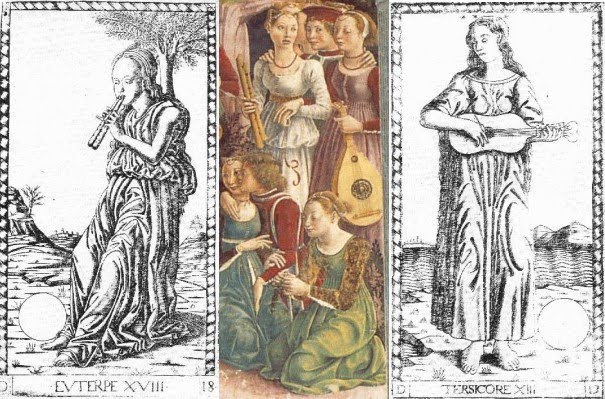
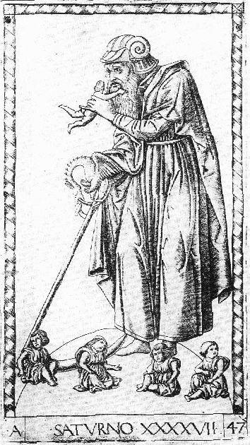
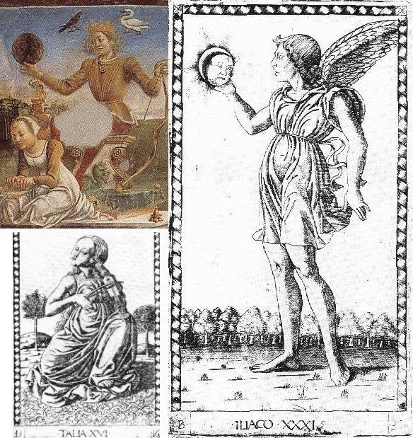
On Saturn, Lazarelli specifies just the merest sign of a beard.
...445. By nature, meanwhile, he starts to cover his chin with signs of a beard and while he walks he fixes his small eyes on the ground...
445. Natus in hoc parua spargit lanugine mentum
Paruaque dum graditur lumina figit humi...
I assume that the translation is accurate.

The S-series doesn't exactly comply with this description, but it does shorten the beard in comparison to the E-series. S follows Lazarelli's wishes, but only a little: it is still not more meager than Jupiter's. By the same token, the S-series has Jupiter with a fuller beard, but still not fuller than Saturn's, as Lazarelli would have wished:
510. His hair is long and his full beard is becoming...
510. Caesaries longa est barbaque plena decet...
Image

A couple of other cards are worth looking at.When we look at Luna, we see that the S-series design follows neither Lazarelli's poem, which specifies that one of the horses be partly black, nor his illumination, which makes one of the horses black and the other white.
Image

And finally we have the Primo Causa. Lazarelli described the "four evangelists" on the outside, and for a second time (after Luna) the illuminator complied with his idea. Moreover, the S-series broke with his E-series predecessor and did the same, giving us the same four creatures in the same four corners (from Huck's post).
Image
Since the Primo Causa was God, and God was Christ, it was a small jump to add these creatures; it was common practice to put them in the corners of mandorlas was a common practice, for example that below.

Image

But the configuration was almost always different: typically the angel and the eagle were on top, and the lion and the bull on the bottom (sometimes switching sides). It is the same on the earliest tarot World card of this design that I know, the "Sforza Castle," as well as all subsequent ones.

Presumably it was felt that lions and bulls, being heavier than angels and eagles, and less frequently found with wings, should be on the bottom. To my knowledge, only the Lazarelli illumination and the S-series "Mantegna," have eagle and lion on top and the angel and bull on the bottom.

But there was another tradition which may have been more fashionable at this particular place and time (whenever that was), penetrating even the territory of the sacred mandorlas. That tradition was that of the four winds, the four temperaments, and the four elements. In his engraving "Philosophia" (http://www.fourhares.com/images/philosophia.jpg), Duerer put air and fire on top and earth and water on the bottom.
Image
That makes sense: air and fire are lighter than earth and water. But Durer also identified the four apostles with the four elements and the four temperaments. In "Four apostles," 1520's, John is on the far left, and Mark on the middle right. (The other two are Peter, middle left, and Paul, far right.)
Image
Duerer identified John with air and the sanguine temperament; hence his red complexion and youthful appearance. John was traditionally identified with the eagle. Mark was identified with the lion, ergo fire, and that is how he is in "Four Apostles So it could be that John, as air, could be put at the top of the Primo Causa iillumination, and also Mark, as fire. presumably on Lazarelli's instruction. And the S-series either followed Lazarelli's instruction as well, or for some other reason independently drew on the same tradition as Lazarelli did, either independently of Lazarelli or before him. All this is speculation, however. The correspondences remain puzzling.

My conclusion is that in view of the discrepancies between the poem and the S-series images of Venus, Luna, and Mars, the S-series designer probably did not have access to the Lazarelli poem. However he might have heard of Lazarelli's complaint about Jupiter's and Saturn's beards being too meager and too full, and tried to adjust the images accordingly, without understanding what Lazarelli was getting at. He also might have heard about Lazarelli's complaint about the lack of animals in Primo Causa and adjusted the image there, too. Why they have the same configuraton in Lazarelli and the S-series remains unexplained. Perhaps someone knows some other explanation, besides supposing either that the "four elements" interpretation of the creatures was in fashion, and adopted either by the S- series designer, or else the S-series designer had some instruction deriving ultimately Lazarelli or from someone who had seen the Primo Causa illumination in his manuscript.