1468: THE ST. GALEN MANUSCRIPT
Not only images from the "Mantegna", but actual engravings so similar they could be slightly earlier than the "Mantegna" itself, appear in a manuscript dated 28 November 1468. The four “Mantegna” cardinal virtue rngravings, of the same size and type as the cards, were inserted as miniatures in Foir di Virtu, a book on the virtues kept in the Benedictine monastery at Saint-Gallen, Switzerland, and completed 28 Nov. 1468. Trionfi has an image with the four pages superimposed on a "Mantegna" Prudence (http://trionfi.com/i/mantegna-tarocchi/index.php). Here is Lambert's description (p. 145)
...quatre tarots inserés dans son texte: La Tempérance, La Prudence, La Force et La Justice."L'écriture déborde sur les marges des estampes, ce qui prouve que celles-ci étaient en place antérieurement à la composition du manuscrit"
The language of the book is German. Here is Trionfi's image of one of the pages, which clearly shows the writing overflowing the margin. "Huck," for Trionfi, says that the engraving, glued onto the page, appears to be by the same engraver as the card (http://forum.tarothistory.com/viewtopic.php?f=12&t=463&p=5955).(...four tarot cards inserted in its text: Temperance, Prudence, Strength, and Justice. The writing overflows the margins of the prints, which proves that they were in place prior to the composition of the manuscript.)

It is not identical to the card, however, because it lacks the animal in the background and the title at the bottom.
Huck, speaking for Trionfi, says that the 1468 engravings were done by the German printer Sweynheim in Subiaco, near Rome, where he had set up a printing press to turn out books on papal commission in a Benedictine Monastary. He would have picked up the originals on which they were based--drawings, woodcuts, or poor quality engravings--in Venice on his way to Rome from Germany. The St. Gallen Monastary is also Benedictine. So the one sent the engravings to the other.
Trionfi points to an observation by print specialist Arthur M. Hind, in 1948, that the engraving of the "tarocchi" is similar to that of a 1478 map based on the writings of Ptolemy put out by the Subiaco printing firm. Trionfi quotes Hind, in the context of the e-series:
(This quote is from p. 228 of Hind; I have added a comma before "found", and the hyphen in "so-called", which Trionfi omitted.) From this Trionfi concludes that the tarocchi were done in the period just before the Ptolemy, i.e. between 1473 and 1478, using copper plates engraved by Sweynheim before his death (which Trionfi says was sometime 1475-1477 (Hind on p. 189 argues that Sweynheim probably died in 1473-1474, as the last book in which Sweynheim's name appears as co-printer is 7 May 1473, after which Pannartz' name appears alone) .On the other hand there is a close similarity between the present series and the engraved maps of the Ptolemy printed at Rome in 1478. The precise cutting of the maps and the representation of forests and hills are closely related in style. If the engraver of these maps is identified, some solution might be found, for the engraver of the so-called Tarocchi might have undertaken the work of the Roman printer.
But Hind argues just the opposite, in a clarification that comes after the passage Trionfi quotes. He says that probably the tarocchi were done in the North, i.e. Venice, and that Sweynheym, the printer, might have met him in Ferrara after the cards and brought him down to Rome. Here is the page. Hind has just been discussing another Ptolemy, which came out a year before the Subiaco one.
.
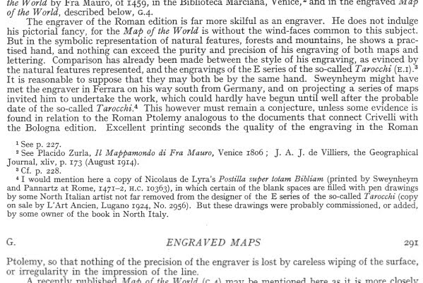
So Hind's "final suggestion" is that Sweynheim had met the engraver of the Tarocchi on his way from Germany in 1465 and recruited him later, in the 1470's to do the engravings of the Ptolemy, for which Sweynheim did the printing. Sweynheim, according to Hind, was a printer, not an engraver.
There are two distinctive features possessed by both the "Mantegna" and the 1478 Rome Ptolemy that lead Hind to his conclusion: first, the "purity and precision" of the engraving, "of both maps and lettering"; and second, "the symbolic representation of natural features, forests, and mountains."
Scholarly consensus now is that Hind was probably wrong in thinking that Sweynheim came to Italy in 1465 (just when the "Mantegna" happened to be published!). He probably came in 1462 or 1463 and set up his printing press in 1464. But this is a minor matter. Sweynheim could have learned about a Ferrarese--or Bolognese or Venetian--engraver from seeing the cards, either in Rome or being sent them from his fellow German printers in one of these cities, or from some other source, such as Lazarelli. "Hind's error," if there is an important one, is something else.
Hind's error, according to Trionfi, was in not knowing that the engraver of the 1478 Ptolemy was in fact either Sweynheim, who would have been engraving before his death in 1475-1477, or his "pupil" Buckinck. Huck, for Trionfi, says,
But was Hind really wrong? Where is it "generally assumed" that Sweynheim was an engraver, who then taught Buckinck? What is the argument? Tony Campbell, Map Librarian at the British Library, says in the course of discussing the letter punches:Hind comes in his analyses to the conclusion, that the "unknown" engraver of the Ptolemy maps, produced 1473 - 1478 in Rome, was likely also the engraver of the Mantegna Tarocchi. However, the engraver of the Ptolemy is not "unknown", generally it is assumed, that they were made either by Sweynheim or his "unknown pupil" Arnold Bucking.
If Sweynheym wasn't an engraver, then he couldn't have taught Buckinck. Buckinck was most likely a printer like Sweynheim. The engraver remains unknown.Skelton has shown that Sweynheym developed the technique [of punches] during preparation of the maps for the 1478 Rome Ptolemy, since the three years Sweynheym spent giving 'instruction in the method of printing from copper plates' were unlikely to hve been concerned with engraving, about which he could have had little specialized knowledge. Skelton's persuasive interpretation is that Sweynheym was referring to what seems to have been a double achievement: the development of a practical alternative to handcut lettering and an improvement in the strength and consistency of the impression taken from the finished plates.((The Earliest Printed Maps: 1472-1500, 1987, p. 223f).
Campbell's reference is to Raleigh Skelton, a printing historian who probably knew, when he was alive, as much about Sweynheim as anyone else in his day. He edited the 1966 Amsterdam facsimile edition of the Rome Ptolemy; in its Introduction is the "persuasitve argument" to which Campbell refers. The argument takes him a couple of pages to present. I will do my best, but it will have to be in another post, because I want to get it right and think about it, too.
Huck, speaking for Trionfi, says that the identity of the engraver isn't really that important. It's the result that matters (http://forum.tarothistory.com/viewtopic.php?f=12&t=463&p=6130). To be sure, I cannot disagree. He also suggests (same post) that "it is not impossible" Sweynheim was in fact the same person a famous German master card maker, "master of the playing cards", who worked with Gutenberg and then disappeared around the same time that we start hearing about Sweynheim I would only comment that according to Huck the disappearance was sometime between 1450 and 1465, and that this "master" might have been more than one person. The large date range reduces the likelihood of a significant coincidence. Life was precarious then; the master might simply have died or become incapacitated.
.
Whoever the engraver was, it seems to me there is a simpler explanation for how the engraving got to St. Gallen than to suppose Sweynheim picked up the requisite drawings on his way to Rome and then had the engravings made. There were Benedictine monasteries near most large cities in Italy at that time. It could have come from any of them, having been instructed by brethren in St. Gallen to look for engravings of the virtues.. In particular, there was a Benectine monastery near Boogna which was actively engaged in producing illuminated manuscripts. We know this from Kurt Barstow, The Gualengi-d'Este Hours, who gives us information about the principal illuminators of that masterful work, Crivelli and dei Rossi. Crivelli's first recorded work was for the Benedictines of San Procolo "working on initials for choir books" ( p. 32). He pawned the parchment, and it was retrieved by the monks! Crivelli's misadventure at least shows that there was an active Benedictine manuscript-making industry in Bologna then.
So did Crivelli design, and perhaps even engrave, the "Mantegna"? There is no evidence of his engraving anything, despite his involvement with the poorly engraved Bologna Ptolemy maps of 1477.. On these maps, The many ornamental features in and around them, such as fish, boats, and water (all added after the first prints), suggest someone with the pictorial eye of an illuminator. And the heads representing the winds (two shown below), surrounding the large map on all sides, are in the style of Crivelli's illuminations of saints.

Hind observed that these heads, despite the roughness of the engraving, are in "the true Ferrarese style" (1938, p. 290). Since all these features were added after the maps were done, it is an open question whether Crivelli engraved the maps.
But if Crivelli was involved with the "Mantegna," it would have to have been at some time when he was not deeply involved in book illumination. He is known to have finished one series in 1465, another in 1467, another c. 1469, another in 1470. and another in about 1469 or 1470 (Barstow p. 32). When did he have time to design the "Mantegna"?
It may be significant that of the small number of saints for which the 1469-1470 Gualengi-d'Este Hours has illuminations, two (both done by a different illuminator, Guglielmo Giraldi) were from Bologna: Catherine of Bologna (who wasn't canonized until the 18th century) and the exceedingly obscure and unofficial St. Ossanus.Both were done by a different illuminator, Guglielmo Giraldi. I know nothing of his work besides these two pieces.
So by 1468 we have 4 virtues and 6 Conditions of Life.Where there are four Virtues, there are probably three more. Where there are 6 Conditions of Life, there are probably more. The PMB tarot already had its Fool resembling the “Mantegna” Misero and a Bagatto resembling the Artisano. By 1468 we already have close to the 20 cards of the “Mantegna’s” 50. And the ‘Pope” card refers us to pre-1464 and even the time of Nicholas V, 1447-1455. In addition, the Belfiore 3 standing Muses account for the design of most of the Muses, Liberal Arts, and Virtues, as standing male or female figures in robes. All that is left are the Spheres, stock representations of the planetary gods.
THE "MANTEGNA" AND THE SCHIFANOIA PALACE
Lambert, following Hind, simply suggests "vers 1465" (p. 145: "around 1465") in Ferrara. Her argument, besides the 1467, 1468, and 1471 manuscripts, is a tylistic similarity to the frescoes of the Schifanoia generally. It would take me too long for me to compare the cards to the Schifanoia here. Historians writing in Italian and English say that many artists were involved; some, it seems to me, may even not have been resident in Ferrara, because Borso wanted the job done quickly.

Different historians have found resemblances to different sections. Gnudi argues, in the excerpt posted by Trionfi (“Artists active in the studiola”), for a resemblance to the December "Triumph of Vesta." Gnudi, Trionfi says, was in charge of the restoration. I have not found a post-restoration reproduction of this scene; all I have is a drawing done a century or so ago (in Roettgen, Italian Frescoes: the Early Renaissance, p. 414) It is of a quite deteriorated fresco, one that looks to me rather generic Northern Italian.
Tyson (p. 59f) sees resemblances to some very different figures in the June, July, August, and September sections, both men and women, in the middle and lower upper parts. To me these all look either too inventive and energetic for the cards or again generic. On the other hand, the cards are close enough to these images that they could have been used by the painters in preparation for their work, since the Schifanoia was done 1469-1471, presumably after the cards. I invite the reader to inspect the frescoes on the Web..
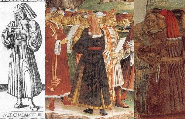
Zucker sees resemblances in the April, May, and June frescoes, the ones done by del Cossa and assistants. These seem to me more promising parallels. From Roettgen's reproductions in Italian Frescoes: the Early Renaissance, this is what I see. First the Merchant, from March and April. I can't tell whether the April merchants, on the right, are reading anything. August, not shown, has similarly dressed merchants, but clearly not reading.
 Next, the Gentleman, both selections from April.
I suppose that some of the men around the March merchants would count as Gentlemen, but both pose and dress are somewhat different.
For the Knight, I found these in March and April. They don't have swords, but their costumes and pose are similar:

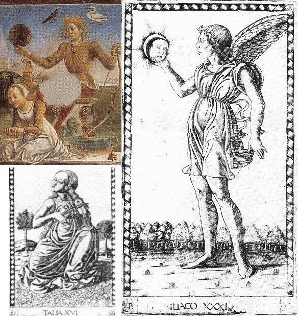
Zucker also finds resemblances at the Schifanoia to Apollo and the Muses: "With some justification, Cieri Via has compared the figure in the engraving [Thalia--msh] to that of Aurora on the chariot of Apollo in one of the frescoes of the Pallazo Schifanoia" (p. 26). And he notes Apollo's attribute of the swan in the "Mantegna" is also at Palazzo Schifanoia (p. 30). I do see the resemblance between Thalia and Aurora, and Apollo's swan (above him, at left below). I also see something else, a resemblance between the Schifanoia's Apollo and the "Mantegna"'s "Genius of the Sun":
 I
also see Thalia on the April wall, sitting on the ground, while above
her Euterpe and Terpshicore are standing, holding their instruments:
I
also see Thalia on the April wall, sitting on the ground, while above
her Euterpe and Terpshicore are standing, holding their instruments: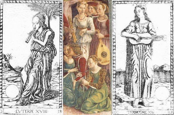
Zucker says that "Clio's swans compare to Triumph of Venus at Schifanoia" (p. 29). Here they are:

The resemblance isn't precise, but why not?
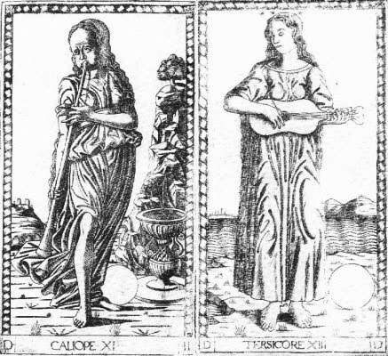
And finally, as Huck pointed out, all nine Muses are in the May fresco to the right of Apollo. There is not much there to suggest the "Mantegna" here except the two instruments, which correspond in the "Mantegna" to Calliope's long trumpet, and Terpsicore's lute. But Terpsicore's face has been transferred to the Muse on her right. A relationship to the "Mantegna" is strongly suggested, even though Terpsicore's instrument is a little different, because instruments were not depicted with Calliope and Terpsicore in Borso d'Este's Muse series at Belfiore (see http://it.wikipedia.org/wiki/Studiolo_di_Belfiore).

To sum up: the resemblances I have been able to find correspond to are 4, 5, and 6 of the Conditions of Man and 11, 13, 16, and 18 of the Muses, and 31 in the three "genii" added to the Virtues series.
As I say, all of these images are in March, April, and May, the three months done by del Cossa and assistants (although somewhat similar figuress occur in August and elsewhere). No art historian that I know of has proposed del Cossa as the designer of the "Mantegna." They mostly use the resemblances to say that the "Mantegna" was Ferrarese. But if the artist was't the same,
the Schifanoia artist, or cartoon-maker for the designs, could simply have used the "Mantegna" engravings for inspiration.
THE "MANTEGNA" IN THE CONTEXT OF ITS INFLUENCES AND WHAT IT INFLUENCED
Levenson et al have interesting things to say about the individual cards. They notice the similarity between the Servant and the PMB Pages of Coins. Iliaco is also similar to the Page of Coins, and there is some similarity betwen Cosmico and the PMB World card. The Artisan is similar a scene in Baldini's Planet Mercury, which I show below. Oddly enough, the standing figure at the right is rather similar to the Servant.

For the Gentleman, they note a comparable hunting scene in Baldini's Jupiter. The King is similar to the Kings of Coins and Staves in the PMB. The Emperor is somewhat similar to the PMB Emperor, and similarly for the Pope.
On the Muses, they note that the globes derive from Capella (the musical instruments do, too). Here is Levenson et al, p. 100
The authors of the National Gallery book also give us an engraving with very similar trees to those of the three cosmic powers in the "Mantegna," leading them to say that the engraver was the same (p. 88). It is housed in the Albertina, Vienna:The most curious details in this group of images are the blank discs which appear with all the Muses except Thalia. According to Jean Seznec, they are meant to represent the celestial spheres of the Ptolemaic universe. Martianus Capella had assigned a sphere to each of the Muses, but since there were nine Muses and only eight suitable celestial spheres (the planets, the sun and moon, and the fixed stars), he placed Thalia on earth, so that the number would coincide (Seznec, p. 141).
These trees were one of the features that led Hind to identify the "Mantegna's" engraver with that of the 1478 Ptolemy. But who is he? The National Gallery authors reproduce a drawing that is like the engraving but without the trees (p. 88, not posted here; it is in the Gabinatto Nazionale delle Stampe, Rome). But they do show us another engraving (p. 158) that seems also to have copied the putti we have just seen. They call this engraving "Ferrarese," but for no stated reason, other than that its putti resemble those in the first engraving, which resembles the "Mantegna" in its trees. This engraving is initialed "F.B." They suspect that it is a niello made from a plate that was not originally intended to produce prints. ("F.B." we learn, stands for "Francia Bolognese," the leading engraver of Bologna in the last quarter of the 15th century.)

They mention but do not reproduce another engraving which they say is also by the same engraver as the "Mantegna," a Death of Orpheus. Here it is, from Hind.

I will discuss this engraving more later.
For the planets, they note that the specific imagery of Mercury, Venus, Mars, Jupiter, and Saturn comes from the Libellus de maginibus deorum, an anonymous work of c. 1410-1420 . Their source is Hans Liebeschutz, Fulgentius Metaforalis(Studien der Bibliothek Warburg 4), Leipzig & Berlin, 1926, p. 118. Fulgentius was an early Christian moralizer of the Greco-Roman gods, as interpreted by a medieval writer. According to Seznec, Survival of the Pagan Gods, the author is one Albricus, called Albricus or Albericus Londonensis or Philosophicus and also Alexander Nequam. Huck game me this link: http://books.google.com/books?id=YOISgW ... us&f=false. There were also illustrations.
On Mercury, we read, among other things
And so we have:...In his presence there was also a cock, specially consecrated to him; on his other side was Argus, whose head and face were full of eyes, who lay decapitated by him.
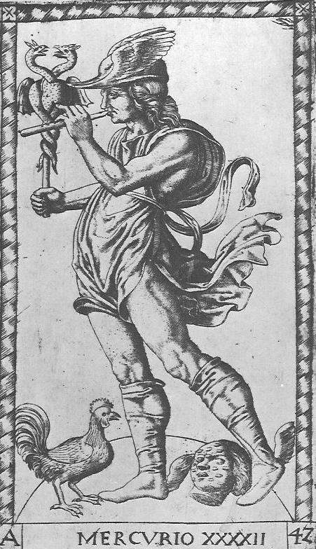
They add that the "Mantegna" image also borrows from "an archaistic relief of Hermes that Cyriacus of Ancona copied on his trip to Greece," according to Fritz Saxl, "Riniscimento dell'Antichita," Repertorium fur Kunstgeschichte 43, 1922, pp. 252ff, and Seznec, Survival of the Pagan Gods, 1953, p 200f (see prevous link, which has p. 201).
Here is the one on Venus:
So we see:Venus was depicted as a very lovely girl, nude and bathing in the sea. In her right hand she holds a sea shell..,.she is accompanied by doves flying around her...and in her presence stand three nude young girls, who are called the three Graces. Two of them have their faces turned towards us, but the third, on the contrary, turns her back. And here stands Cupid, her son, winged and blind, who shot Apollo with the bow and arrow he holds.
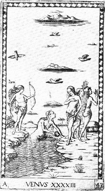
The convention was for the one turning her back to be the one in the middle. I will give a model a little later for the present arrangement.
The one for Mars is as follows:
Thus:It is said that Mars is the third of the gods, and he is third in the order of the planets....his figure was of a man raging, seated in a chariot, clad in mail and armed with other offensive and defensive weapons; he had a helmet on his head...and was girded with a sword....Before him a wolf carrying a sheep was depicted, as that animal had been specially consecrated to Mars by the ancients.
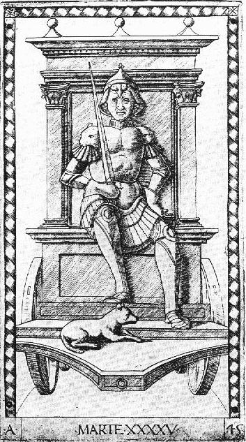
Our engraver seems to have decided to leave off the sheep and to stick to just one weapon.. Levenson notes that the S-series substituted a dog for the wolf, thus showing that the engraver did not know the E-series source.
And here is Jupiter:
Jupiter, son of Saturn, to whom the rule of the heavens was given in the oracle, was depicted seated in an ivory throne, in his seat of majesty, holding the scepter of rule in his left hand. Frm the other, that is the right, he hurls thunderbolts downwards, keeping the Titans in check with his thunder and treading them beneath his feet. Together with him is his eagle, which, flyiing, carries beneath his feet the very beautiful youth, Ganymede., whom he abducted; the latter has in hand a crater, to fill Jove's goblet.
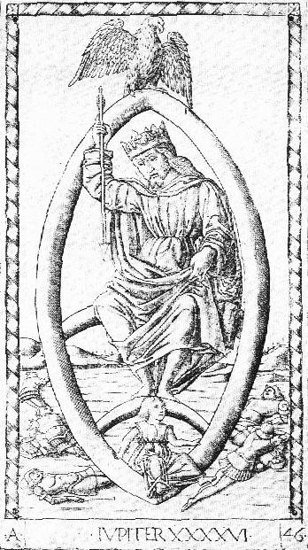
The engraver has obviously departed from this description, in favor of more amorous references. Also, its Jupiter, unlike in the Libellus, is not seated on an ivory throne, but rather on a rainbow, an image which comes from 14th century illustrations of Ovid, Levenson et al say.
Finally, of Saturn it says:
He was depicted as an old man, gray-haired, with a long beard, stoooped, melancholy, and pallid, his head covered...he holds a sickle, and in the same hand he carries the image of a serpent which bites its own tail with its teeth. With the other, that is, the left, he brings a very small child to his mouth, and appears to devour him. Near him he has his children, that is, Jove, Juno, Neptune, and Pluto, of whom Jupiter castrated him.
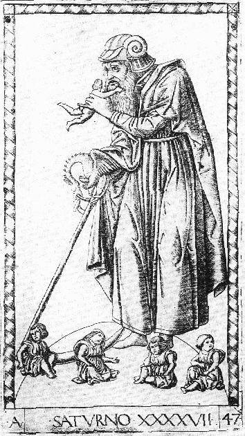
The image is quite close to the description.
Regarding these texts, I don't know how we would tell whether they were accessible to one rather than another of Sweynheim's circle in Rome, the humanists of Bologna , or those of Ferrara or Florence. The similarities to Baldini suggest an engraver from that workshop in Florence-- and Florentine engraver/goldsmiths were more likely to be working in Bologna than Ferrara.
Besides Levenson et al, the other major commentator on the "Mantegna" in English is Mark Zucker, in The Illustrated Bartsch, Vol 24 Part 3, to which I have referred.y.
Page 4-5: He says that the prints have "precise contours and fine rectilinear crosshatching, technical properties suggesting northeastern Italy rather than Florence, where contemporary Fine-Manner-engraving was far less disciplined and meticulous." [I don't agree with respect to Rosselli's early work.] He observes that "instead of deep, rich blacks, one tends to find subtle delicate grays resulting from the use of a variety of different-colored inks." He says that "within the field of fifteenth century Italian engraving" the E-series' "elegant craftsmanship is unsurpassed."
Page 6: about the E-series:
Pp. 9-19, Conditions of Man. Comparisons to the genuine tarocchi, especially the PMB (for Beggar, Servant, Artisan, Knight, King, Emperor, Pope) and occasionally Sola-Busca (Servant, Knight, King). Gentleman compares to two "falconer cards" in Dummett 1980 pp. 73-74; and to Marco Zoppo's Parchment Book of Drawings (Ruhmer Marco Zoppo 1966, figs. 88, 90, 91, 105).Only a single state is known, and there are no impressions showing later rework to the plates. All known impressions show small circular marks at the four corners of the decorative orders, signs of holes resulting from the plates' having been nailed down or riveted to, and then removed from a (wooden?) support prior to the process of printing. Such marks do not appear on any impressions of the S-series, but they are exceedingly common in niello prints and not uncommon in early Italian engravings generally; their significance remains somewhat conjectural.
...
Impressions Printed in Colored Ink. Many impressions of the E-Series are printed in inks of a color other than pure black or grayish black--for example, the sets noted above in London, Naples, Paris BN, Paris CR, Pavia, and Vienna, which include such tones as light bluish (Paris CR), greenish (Naples, Pavia, light bluish green (London), and light greenish brown (Paris BN).
p. 24: Donati saw a connection of Erato to the tambourine-playing angel in Raphael's early altarpiece of the Coronation of the Virgin, now in the Vatican Pinacoteca, but "the figures are only similar in a general way, and a direct connection is highly unlikely."
p. 26: Thalia is also on the ground covered with vegetation at Tempio Malatestiano.
p. 27. "Melpomene's resemblance to figures of trumpeting angels in Last Judgment scenes was rightly noted by Westfehling."
p. 30. Apollo's attribute of swan at Tempio Malatestiano.
PP. 31-41. Liberal Arts. Main source is Capella's De nuptis, as was usual until the High Renaissance (except Poetry, not in Capella). The pictures compare to descriptions in Art du blason, except for Astrology and Theology, and "show unequivocally" that it "corresponds to the E-series rather than the S-series." (My comment: The Art du blason, once thought to be 15th century, is dated to 1531
p. 33. Notes engraver's propensity to replace traditional serpents with dragons, in Logica and also Chronico, Prudence, Mercury and Saturn.
P. 38: source for Poetry seems to be various aspects of his own Muses.
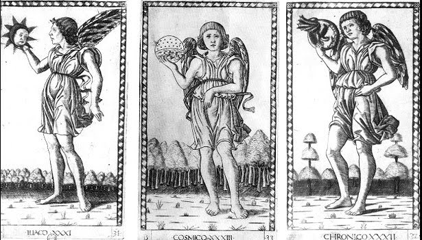
PP. 42-50: Genii and Virtues. P. 42: No visual precedents for Genii except the tarocchi, "which frequently served as a visual source material for the series as a whole." Iliaco, from the Greek Heliakos--personifies the Spirit or Genius of the Sun, or of light." Trees compare to trees in background of PMB Knave of Coins, as well as cards shown in Kaplan vol. 1 pp. 104 and 105. [These are the PMB-style Victoria and Albert cards, undoubtedly he means the Star and the Pagte of Coins. On p. 105 it is the Andrioletti Pagte of Coins. I hadn't noticed this. Here they are (V&A in center column), with comparable trees in the "Mantegna" and the "Cupids":

P. 43. Chronico, Genius of Time. Again, a dragon instead of a serpent. Notes that Baldini also changed serpent to dragon in his Aaron, and Rosselli in his Moses on Mount Sinai. Thematic relationship to Hermit in tarocchi.
p. 44. Cosmico, genius of the world. Thematic relationship to World card in tarocchi.
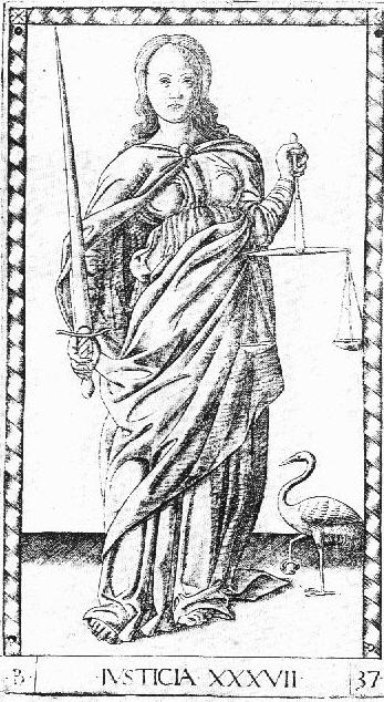
pp. 45-50. Temperance. Why the animal, an ermine, symbol of purity or chastity, should be looking in a mirror has not been satisfactorily explained. Temperance, Justice, and Fortitude are all related to tarocchi, although in Fortitude's case not to the PMB.
pp. 51-61. Planets and spheres. Planets all use traditional images. The three spheres come from Dante's Convivio, although not described there in a way that lends itself to images. Zucker comfirms relationship observed by Levenson between the “Mantegna” and the Libellus.
P. 52: The water on the card is one of Luna's attributes; compare to Baldini's Luna in his Planets series.
p. 53: Pose and costume of Mercury reflect "a Hellenistic relief transmitted to fifteenth century Italian artists via a drawing by Cyriacus of Ancona (ill. Saxl, fig. 21; see also Seznec citing other Renaissance examples)."
p. 54. Venus compares to Star in later tarocchi. Also this:
P. 55. Sun: The winged figure, not traditionally male, may be Aurora. "The scorpion, placed emblematically in the sky above the horses, is also an element in the legend of Phaeton (Hall, Dictionary of Subjects and Symbols in Art, rev. ed., 1979, pp. 243-44, 275)."Partial copies of the engraving, unrecorded by Hind, may also be noted on the frontispiece of a Livy manuscript in the Vatican Library (MS Borghes, Lat. 368; see Rathe, “Sulla classificazione di alcuni incunabili calcografici italiani,” Maso Finiguerra 5, 1940, p. 6-7 and fig. 2); and on a Venetian glass chalice of ca. 1475 in the Cleveland Museum of Art (Venice, p. 74, no. 64), the other side of which has a partial copy of an unrelated early Florentine engraving, The Peddler Robbed by Apes, either TIB 2405.047 or 2405.048).
P. 56. Mars. Absence of a sheep shows that engraver had no direct knowledge of the Libellus, "although he was certainly familiar with the tradition it exemplifies." (My comment: he might simply have schose to leave it out..) Compares to King of Swords in PMB and Chariot of various packs. "Comparison may also be made with a miniature painting by Marco Zoppo showing Mars on a Triumphal chariot n a Virgil manuscript of the early 1460s (see Alexander, ”A Virgil Illuminated by Marco Zoppo Burlington Magazine 111, pp. 514-517, 1969, fig. 40). (I will show this later.)
p. 57. Similar mandorla with a rainbow is in Francesco del Cossa's panel of St. Vincent Ferrer, now in the National Gallery of London (Ruhmer, Francesco del Cossa 1959 pl. 69).
P. 59. Eighth sphere: figure similar to Muses. Arc of orbit also appears in engraver's depictions of planets.
p. 60: no visual precedents for Primo Mobile. [Zucker translates this as "Prime Mover," it actually means "First Moved"?]
p. 61. Prima Causa. Conventional medieval image of the Universe, with 13th century Sphera mundi of Johannes Sacrobosoco as the "most widely read [and illustrated] source for this universal paradigm" (Dixon, Giovanni di Paolo’s Cosmology,” Art Bulletin 67, 1986, pp. 604-613, p. 606.
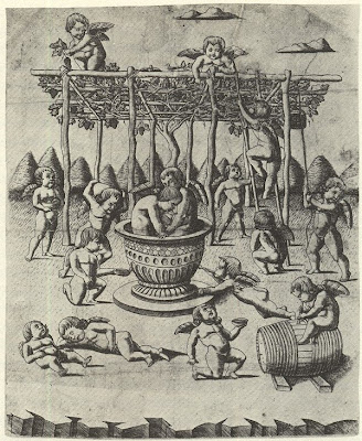
hen there are the two other engravings identified by Levenson as by the same Master, the "Cupids at the Vintage" and "Death of Orpheus." I've already posted images of them. Of the first, Zucker (p. 157) notices the similarities to the trees in the three genii (already noticed by Levenson) and also
Here are the images.between the awkward foreshortening of the child Phaeton, tumbling through the sky in The Sun, and the equally awkward foreshortening of two cupids in the foreground here. In addition, the fine rectilinear crosshatching of the engraving is precisely comparable to the technique of the Tarocchi (p. 157).

Zucker's most interesting comment is about its dating:
Zucker ends,"...there is a partial, unreversed copy of the print in a manuscript of 1466 (see Rathe, Kurt, "Sulla classificazione di alcuni incunabili calcografici italini," Maso Fineguerra 5, pp. 3-13).
I have already referred to one that does, at the Getty in Malibu.No doubt some classical model or models lie behind all four of the fifteenth-century prints, although none of them corresponds in any detail to surviving classical examples.
On the "Death of Orpheus" (p. 155f), Zucker observes that it, like the "Mantegna" itself, was originally thought to be Florentine. But since the artist is clearly the same as the "Mantegna," it must be from Ferrara, Zucker argues. Orpheus in that pose is found in classical art (Warburg, Gesammelte Schriften 1932, figs 99-100 facing p. 446). In the Renaissance, it is in the engraving of Hercules and the Giants, after Pollaiuolo. For Pollaiuolo's own versions, see Ettlinger, Antonio and Piero Pallaiuolo 1978 pls. 88, 105. The complete composition is present in several examples: The Death of Pentheus, in Zoppo's Parchment book of Drawings (Ruhmer Marco Zoppo1966, pp. 77-81, fig. 98). The city on the hill corresponds in the same book to fig. 99 of Ruhmer. More closely related is the early Duerer drawing, Death of Orpheus, but with a different landscape and musical instrument. But the design itself did not originate with the "Mantegna," but in some lost work of another. Pollaiuolo is posited by Armstrong, Paintings and Drawings of Marco Zoppo 1976, p. 278ff; but most historians, including Zucker, favor Mantegna.
We will look some more at Zoppo. He was from Bologna. I see that pre-1465, Zucker notices a lot of Florentine comparisons, as I do. The Ferrara ones are all post-1465. So I still don't see why the "Mantegna" artist couldn't be a Florentine working further north, c. 1465.If nothing else, the character of the landscape is Mantegnesqu3e to the core, and Roessler-Friedenthal ("Ein Portraet Andrea Mantegnas als Alter Orpheus im Kontext seiner Selbstdarsellungen," Roemisches Jahrburch der Bibliotheca Hertziana 31, pp. 149-185) has recently contended that the head of Orpheus in Duerer's drawing (but not in the Ferrara print) faithfully preserves a self-portrait of the young Mantegna.
MORE ON MARCO ZOPPO
Here is the Zoppo's Triumph of Mars that Alexander writes about in Burlington Magazine 1969, pp. 514ff. It's done with purple dye, Alexander says.

The relevant paragraph in Alexander's article is the last:
By "the same arms," Alexander means "the arms of Morosini of Venice, argent a bend azure," which appears on the first page of the present manuscipt. The Triumph of Mars is one of three, in addition to the first page already referred to; it is the frontispiece to the Aeneid. The others are an Orpheus charming the bests, frontispiece to the Eclogues, and a Bacchus and Ceres, frontispiece to the Georgics. Of all of these, Alexander says, "Though intensely classical in feeling and in detail, I cannot find that any of these miniatures is based on specific antique prototypes."The scribe of the Virgil is probably Antonio Tophio. His coloured epigraphic capitals and fine Roman hand belong to the same current of Paduan humanism as does the now famous script of Bartolomeo Sanvino. Since Tophio was probably of an older generation than Sanvino, he may have been his predecessor. Another manuscript, signed by Tophio and with the same arms, was certainly decorated by the same artist and is adated 1463. Topho was in Rome in 1466. Probably he went there to work for the Venetian Pope, Paul II, for whom he wrote a manuscript in 1469. The probability is therefore that the Virgil was completed in Venice in the early 1460s. (Zoppo is documented in Venice in 1461 and 1462.)
In a footnote Alexander says, "The figure of Mars shows a general similarity to the Mars in the 'E's series of so-called 'Instructive Prints' or 'Mantegna Tarocchi.' There are also footnotes documenting the premises to his argument, which I can cite if needed.
There is more about Zoppo in the catalogue book Padua in the 1450s: Marco Zoppo and his Contemporaries, 1998, by Hugo Chapman for the British Museum. It is the most recent thing I could find on Zoppo--actually, so far the only thing within 500 miles of me. It will take a while before I get reproductions of some of the things that Zucker compared to the "Mantegna" series. But I do have a few rather poor reproductions to post, from the copy machine. First, here is one of the Zoppo drawings from his Parchment Book (also called the Rosebery album), c. 1455-1465 (Padua in the 1450's p. 66), that Zucker compared to the Gentleman.
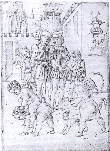
The "homosexual imagery" in the scene with the putti leads Chapman to say that the series was a "private commission" (p. 38). He adds, same page:
If all but the section that compares to the "Mantegna" is removed, and beneath it are put both the "Gentleman" and the "Cavalier" from the "Mantegna," I think we can see some similarity.Zpppa's witty and slighty irreverent references to antiquity, such as the enormous foot on a pedestal onin the background of the drawing of the putti playing with the bellows, suggest that the patron might have belonged to the sophisticated literary and humanist circles of either Padua or Venice.


The compositional technique of having a boy (other than putti) next to the adults is also used in the "Mantegna" figures.
And here is the "Death of Pentheus" that Zucker compared to the "Death of Orpheus" that he determined is by the same artist as the "Mantegna." Below it I have put the "Orpheus," for comparison (disregard the difference in reproduction quality).


Again there is a clear resemblance.
Against Zoppo Huck rightly observed that there were usually numerous putti in Zoppo's works. In the "Mantegna", however, putti are present in only two of the designs, Rhetorica and Prudencia (http://forum.tarothistory.com/viewtopic.php?f=12&t=463&p=6541).
The other engraving that Zucker and Levenson found similar to the "Mantegna," as I mentioned earlier, is one of putti in a grape harvest. Here it is again, so you don't have to flip back to my earlier section.

Levenson (p. 158)saw that engraving's imagery reflected in a later engraving (c. 1475-1500), perhaps a niello, the background of which reflects several in the "Mantegna."

Levenson calls this one "Ferrarese" with a question mark. It is unsigned, but there are the initials "F.B." at the bottom, in reverse. Zucker mentions one possibility for these initials that has been suggested: Francia Bolognese, one form of the signature of Bologna's first known major engraver, exclusively niello until late in life as far as I can determine; he was also a goldsmith. That the initials are reversed suggests that the plate was not originally intended to be printed, Levenson points out. That the derivative work is by a Bolognese is one more piece of evidence that the original was from the same city.
Now I will get back to Zoppo's Parchment Book. Here is another drawing from the series, and the "Mantegna's" Venus alongside it. Zucker seems to have missed this one.

The "Mantegna's" graces are unusual in that they don't have the one on the sides facing in the totally opposite direction than the one in the middle. Instead, they are at a ninety degree angle to her. Perhaps this is because the compositon borrows from the Zoppo. Besides the figures and the composition, the trees are also interesting. True, the nymphs' faces are bit eccentric compared to those of "Venus," but they were for a different audience, elite vs. ordinary.
Here is another drawing from the same set:

The trees are quite remniscent of those behind the three genii, especially if you consider that Zoppo might just have been the designer, not the engraver.
So Zoppo is pretty interesting. Why couldn't he have been a designer of the "Mantegna"? There is no evidence that he did engravings, although engravers and illuminators oftendidn't sign their work. But the engraver of the "Mantegna" was too good to be doing engraving as an occasional sideline. From the records of his training--Gothic painting in Bologna and Squarcione's studio in Padua (recounted by Chapman)--there is no evidence of such training, or anything in metalwork. Hind thought the "Mantegna" engraver was Venetian, based mainly, I think, on the workmanship of the 1470 engraving of the pope and the emperor. Zoppo certainly had Venetian connections. His drawings, with their slanted parallel lines as shading, are very similar to how engraving of that time looks. Their 16th century owner in fact did engrave them in the 16th century, according to Zucker. In their shading, the only thing in the "Mantegna" that is missing from Zoppo's drawings is cross-hatching, which, as I showed earlier, is a prominent feature of Rosselli's engraving work in Florence of the mid-1460's.
There are a couple of other things of interest in Padua in the 1450s, pertaining to Zoppo's "Triumph of Mars." Alexander said in his article that in 1461-1462, the time he thought that Zoppo did the "Mars" and three other Virgil illuminations, Zoppo was in Venice. Here again is Alexander:
Alexander footnotes all three of these sentences with documentation. That Zoppo was in Venice 1461-62 certainly needed a footnote! However the footnote for that sentence is just some added thoughts that have nothing to do with Zoppo's whereabouts in 1461-62. In fact, according to Chapman, Zoppo is well documented as being in Bologna at that time. Another apparent error of Alexander's is the identification of the scribe and date: Chapman says that the scribe of both the works that Alexander attributes to Trophio was Bartolomeo Sanvito, and that the Virgil was probably done c. 1464 rather than 1461-62( p. 32f).Another manuscript, signed by Tophio and with the same arms [of the Venetian patron, Morosino--mh], was certainly done by the same artist and is dated 1463. Probably he went there to work for the Venetian Pope, Paul II, for whom he wrote a manuscript in 1469/1470. The probability is, therefore, that the Virgil was completed in Venice in the early 1460's (Zoppo is documented in Venice in 1461 and 1462).
These errors make little difference for Alexander's conclusion. Zoppo was friends with Sanvito in Padua, where Zoppo lived 1451-1455, and probably also in Venice, where Zoppo moved in October 1455 (Chapman p. 28). Trophio was Sanvito's teacher, and both scribes had the "fine Roman hand" that indicates "the same current of Paduan humanism," as Alexander put it. Illuminators often lived in different cities from their patrons. But Zoppo's whereabouts does make some difference in the matter of the "Mantegna."
Here is what Chapman says (pp. 31-33):
However the works thought to date from this last period, with their "pelllucid colouring and the atmospheric landscape setting" show the effects of "Zoppo's long sojourn in Venice" (p. 34).Nothing is known of Zoppo's activities after his departure from Padua by October 1455 until 1461, when he is known to have been in Bologna. His presence in the city is documented by a series of payments for decorative work in San Petronio dating from 1461-2. In the city he painted two works, both of which are still in situ: the Crucifix painted for the church of San Giuseppe, and a polyptych for San Clemente, the chapel of the Collegio di Spagna...
...
It is not known when Zoppo left Bologna but it must post-date September 1462, when he wrote a letter from the city to the Marchesa of Mantua in relation to a commission for two pairs of cassoni. One of the excuses he offers for not having completed the work on time is that he wants them to be worthy of comparison with the work of his friend Mantegna, who two years earlier had gone to serve the Gonzaga in Mantua. Zoppo is next recorded in Venice, where in 1468 he executed an altarpiece for the church of Santa Giustina.
...
In 1471 Zoppo painted the high altarpiece for the recently constructed church of San Giovanni Batista in Pesaro. The building had been commissioned by the lord of Pesaro, Alessandro Sforza, and it is likely that Zoppo was his choice....From the period between 1471 until the artist's death in Venice seven years later there are no securely dated works.
So how long after September of 1463 did Zoppo move back to Venice? Chapman notes that Zoppo's friend Felicio Feliciano "was the scribe for the second and expanded version of Marcanova's solloge, the [i]Collectio Antiquitatum (Bibliteca Estense, Modena), and he was probably responsible for recommending Zoppo to execute a full-page drawing of ancient Rome" (p. 22). So he was probably in Bologna the first half of the decade. That is also when Chapman thinks the drawings of the Parchment Book were done. Later Chapman adds:
So the time when the Parchment Book was done is roughly when Zoppo was in Bologna, which is just prior to when art historians say the "Mantegna" came out. In all likelihood Zoppo knew Galasso, the artist of the two Muses. They could have worked together, Galasso aged in his 40s and Zoppo around 30. After that Venice would be the logical place to find an engraver, perhaps even one motive for going there. Or perhaps there was a good one in Bologna, fresh from Florence. Or Mantegna got them engraved, in Mantua.The drawings in the album are comparable in handling nad figure style to the ex-Colville sheet (cat.no.8) and a study in the Uffizi (Armstrong 1976, pp. 396-7, no.D.3). Both the latter drawings are dated by Armstrong to the second half of the 1450s, and on stylsistic grounds the album can be assigned either to the same period or to the first half of the 1460's, when the artist is known to have been in Bologna. The later dating is perhaps more likely, as the stylized archiectural setting of Zoppa's drawing for the manuscript of Marcanova's Collectio Antiquitatum (Biblioteca Estense, Modena), finishe in bologna in 1465, is similar to that in some of the backgrounds in the Rosebery album [i.e.the Parchment Book--msh]...
We have yet to find an engraver. I have one idea. But since Trionfi has already proposed Sweynheim, I think I should look at their "Lazarelli Hypothesis" first.
No comments:
Post a Comment