Ludovico Lazarelli was an aspiring young humanist looking for patrons. Trionfi refers to a story that Lazarelli picked up the designs as prints in Venice, around 1468 or 1469. The source for this story is described by Levenson et al, Early Italian Engravings from the National Gallery of Art, 1973. They have a footnote about Lazarelli's picking up the cards in Venice {p. 83):
Presumably the reason the mention of the bookstore is significant is that the authors are surmising that the prints were already considered a book when Lazarelli bought them, similar to the volumes in which many of the extant copies are still found.According to Lamberto Donati, "Le fonti iconographische di alcuni manuscritti urbaniti della Bibliteca Vaticana...." La Bibliofilia, 60, 1958, p. 50) Lazzarelli's nephew described the author as having obtained in a Venetian bookstore a collection of figues of the antique gods and also the Liberal Arts, which led him to compose his poem: "Ivi [Venezia] ritrovo in una Bottega di Librajo una raccolta di bellissime figure di Deiti de' Gentili, con molte immagini rappresentati le Arti liberali, la quale servigli di motivo per comporre un operetta distinta in tre libri, intitolandola de Imaginibus Deorum Gentilum." The "raccolta di figure" was presumably the Tarocchi prints. It is particularly interesting, from our point of view, that Lazarelli found them in a bookstore.
Here is a longer quote from Donati, given by JOhn Meador on LTarot, reproduced on the THF thread by Ross G.R. Caldwell (http://forum.tarothistory.com/viewtopic.php?f=12&t=463&p=6215)
Gli Urbinati Lat. 716 e 717 contengono un poemetto di Lodovico Lazzarelli da Sanseverino nelle Marche, nato net 1450 e morto net 1500 << Vedi GIAN FRANCESCO LANCILOTTI, Ludovici Lazzarelli septempedani poetae laureati Bombyx, Aesii, Bonelli, 1765.>>, "De imaginibus gentilium Deorum". I due codici sono l'uno all'altro similissimi ne sono gli unici perche, oltre alla notizia datane dal Lancillotti, p.13-14, "Duo exempla huius Libri extant in Bibliotheca Vaticana inter Codices Urbinatenses n. 716. et 717", nella vita di Gian Francesco Lazzarelli di Sebastiano Ranghiasci leggiamo: " Dalla stessa Famiglia Lazzarelli discese it famoso Lodovico Lazzarelli di S. Severino Poeta Latino, laureato da Ferdinando Re di Aragona, di cui io tengo un prezioso Codice De Immaginibus Deorum, che forse un giorno pubblichero colle Stampe" <<SEBASTIANO RANGHIASCI, La vita di Gio. Francesco Lazzarelli, Perugia, Riginaldi, 1779, p. 7, n. a.>>. Donde il Lazzarelli traesse ispirazione per il suo poemetto e detto nella Biblioteca Volante di Giovanni Cinelli Calvoli da una vita inedita scritta dal nipote Fabbrizio: "Ivi (Venezia) ritrovo in una Bottega di Librajo una raccolta di bellissime figure di Deita de' Gentili, con molte immagini rappresentanti le Arti liberali, la quale servigli di motivo per comporre un operetta distinta in tre libri; intitolandola de Imaginibus Deorum Gentilium; la quale restituito alla Patria inviolla a Federigo Duca di Urbino, da cui ricevette in dono cinquanta Ducati d'oro, ed un mantello" <<Della biblioteca volante di Gio.Cinelli Calvoli... Scanzia XXII. Rovereto, Berno, 1736, p. 129-130.>>. Questa raccolta non e altro che i "Tarocchi del Mantegna""Later Levenson et al cite Donati again. After mentioning the four additional gods, whose images they reproduce, the authors add (p. 84):
-Lamberto Donati: "Le fonti iconografiche di alcuni manoscritti urbinati della Biblioteca Vaticana"; in Bibliofilia,Vol. 60, 1958
It would appear that Trionfi's "Lazarelli hypothesis" originated with Donati, as described by Levenson et al, who also supplied the pictures of the four gods that Trionfi uses. I wonder if there are more pictures in Donati's text itself, since it is so long. I looked on WorldCat, but so far I can't find it. I guess I need the help of a librarian.It is quite possible that these additional illuminations are of Lazarelli's invention. On the other hand, it is conceivable, as Lamberto Donati has suggested, that Lazarelli had access to a more extensive series of images, perhaps a set of miniatures, on which the Tarocchi engravings are themselves based. (Footnote: We cannot, however, agree with many of the details of Donati's complex and highly speculative theory (pp. 66-125 regarding the hypothetical prototype of the Tarocchi.)
As Trionfi notes, it is not clear whether on this account the prints purchased were drawings, woodcuts. or engravings, or colored or black and white. So they could have been engravings, like the "Mantegna" we know, perhaps hand-painted, as the Sola-Busca were a little later. Or the color was added by Lazarelli. He then wrote a long narrative poem based on 23 of the images of the "Mantegna," which he had illuminated for his manuscript.
I notice that in Donati, there is no date for Lazarelli's visit to the bookstore. Trionfi's 1368-69 is an inference. But it makes sense. According to Stephen Campbell (2004), Lazarelli's manuscript was finished by 1471. That dating is secure, according to both Campbell and Lambert, and acknowledged also by Trionfi. The reason is that on one of the two copies there are "traces of a canceled dedication to Borso d'Este," as Campbell puts it (p. 127). (His reference is to an article by Lamberto Donati, "Le fonti iconografiche did alcuni manoscitti urbiniti della Biblioteca Vaticana," in La Bibliofile 1958, 60-1, 48-129.) Borso died in August of 1471; normally the dedication would be added last, in case of just such eventualities. The location also makes sense: the writing at the bottoms of f the cards is in the Venetian dialect, suggesting prints for the Venetian or at least Northeast Italian market.
(According to Trionfi, however, the writing on the bottom was added when they were engraved, c. 1475 near Rome)
The illuminations correspnod quite exactly to the completed original "Mantegna", except that there is no border and no title. Trionfi says that the enterprising Lazareelli had the idea of putting out 50 of the prints together as engravings and sell them as a set, something he did, probably with the help of his sponsor Zaen, during the time Lazarelli was in the Rome area, with the help of Sweynheim as engraver or at least( engraver's employer). Sweynheim died in around 1474, and his partner Pannartz, under the name Bucking or Buckink, did the printing, Trionfi says..
(Trionfi's argument is in various places: the main material is at http://trionfi.com/0/m/16/, in the sections "Hind's error," "Hind's final suggestion," and "Lazarelli Hypothesis," with more at http://trionfi.com/i/mantegna-tarocchi/index2.php, repeated at http://trionfi.com/mantegna/.)
There are several problems with this idea, aside from the difficulties already mentioned (the four virtue engravings done by 1468, and the opinion of all experts that Sweynheim was no engraver). One is that the titles are in Venetian dialect. Why, for a Roman market, especially considering that pilgrims from other regions would be part o fhte market, would Sweynheim do that? The cards are clearly for a Venetian market, a place it is hard to seeanyone near Rome choosing. It would be more logical for the titles to be in Latin, for non-Italian speaking pilgrims, or at least Tuscan, the language of the literati.
Another problem is that in the text of his poem, Lazarelli has serious issues with the content of the illuminations that he shows us; he is denigrating them. If so, it is difficult to see how he would want to continue this bad precedent in a series of engravings that portray exactly what he finds objectionable.
I have finally read Ludovico Lazarelli's famous poem, De Gentilium Deorum Imaginibus, in William J. O'Neal's translation. So here I go again.
O'Neal has inserted 27 section-headings, for easy correlation to the "Mantegna." It is all quite predictable, just as you say it should be. The first 10 have the same names as the Spheres series in the "Mantegna," from First Cause to Luna. Then come 2 personified Liberal Arts, Musica and Poesia; then Apollo and all 9 of the Muses; and finally Athena, Juno, Neptune, Pluto, and Victory. Only one of the latter subjects corresponds to a "Mantegna" card, namely Athena, for which Lazarelli has used one of the Liberal Arts series, Philosophia. Included with the poem are 27 illuminations, 9 of which are reproduced in small black and white versions in Kaplan, Vol. 1, p. 27; 4 more are on trionfi.com; 1, Saturn, appears in both places. The description of each deity in the poem is enough like what is on the corresponding "Mantegna" card that it is clear, even for the illuminations I have not seen, that what is depicted in something like the figures on the cards, all except the last 4, which are quite different, as can be seen in Levenson and on Trionfi's website.
These contents correspond quite closely to the alleged report by Lazarelli's nephew, that Lazarelli bought "prints of the gods and the liberal arts" in a Venice bookstore. The "prints of the gods" that he bought are the 10 Spheres plus the 9 Muses and Apollo. Of the Liberal Arts prints, he used three of them. The others might have gone to Urbino, as Trionfi says, freely adapted there in illuminations for an edition of Martius Cappella.
So it seems that in Venice one could buy the engravings in separate lots of 10. The poem does not touch upon the Conditions of Man, and likewise the virtues, except that Libra is extolled as a fitting symbol for someone such as his patron:
That, of course, was originally meant for Borso, who built a statue of himself holding the scales. So Borso died. It will do just as well for his new patron, Federico.(1, 353)...A worshipper of Justice needs suitable signs for himself where just Libra bears equal hours on its scale).
In his poem describing the various gods, Muses, and Liberal Arts, Lazarelli shows off his erudition by explicating the symbolism in the pictures, mostly putting into words the imagery depicted in the "Mantegna." But there are discrepancies, where the description and the card don't match in all details. For determining Lazarelli's relationship to the cards, these discrepancies are what is interesting
(1) I will start with Lazarelli's description of the Three Graces, corresponding to the right side of the Venus card in the "Mantegna."

Lazarelli says:
737ff. The Idalian nymphs, the fair and pleasing crowd of three, stand together with their bodies unclothed. They hold their arms together bound by interchanging bonds as often interchanging Love ties the bonds.
(Stant simul Idaliae nudato corpore nimphae,
Candida turba trium grataque turba trium.
Vincta tenent simul alternis sua brachia nodis,
Vt saepe alternus uincula nectit Amo.)
In the "Mantegna," the Three Graces are not actually shown holding their arms together in the way Lazarelli describes. The classical example is in for example in this 1486 medal of Giovanna Tornabuoni (from http://www.fitzmuseum.cam.ac.uk/gallery ... medal.html). They are shown similarly in the April section of the Schifanoia frescoes, by Francesco del Cossa (many images on-line). Nor do two of them see us in the eyes of a third who is looking at us, as Lazarelli says they do.The first holds the light of her countenance and her eyes toward us. The rest of her group sees us in her gentle eyes. First, Pasithea enraptures us in her gentle fires. Aglaia revives those taken in with her flattery. Euphrosyne entangles them in fetters and strong chains, and she does not permit her captives to go back.

A later variation, the 1482 Primavera by Botticelli, shows them putting their arms together in a different way (image taken from http://www.hektorparis.com/botticellis-la-primavera/). Unlike on the card, the arms still intertwine.

The rest of Lazarelli's description is interpretation, again different from both the traditional depiction and the "Mantegna" version. It is not flattering to the Graces. This view could perhaps be read into Botticelli's by a cynical observer: one of the Graces looking love-sick, but really trying to entrap Mercury, who warily avoids her gaze. It is more likely that Lazarelli is imagining something along the lines of an illustration in Gafurius's Practica Musicaof 1496, which Huck has already showed us. Let us look just at the top, where the Graces are to the left of Apollo. You will see the three nude ladies, their arms intertwined in a way that fits Lazarelli's description even better than the classical pose, although the one on the left is not looking at the others, as she would in Lazarelli's description

No hapless lover is in chains, but it does look as though the two facing Apollo are holding tight to the third one, and her to them, with the chains of their strong arms. This, like Lazarelli's, is a rather unflattering portrayal. It is part of a strong bias against Venus and her circle; Seznec, for example, shows us one medieval illumination that has Venus as a prostitute.

What is Lazarelli doing? I think we need to be aware that he wrote the poem intending his patron to be Borso d'Este, who was a life-long bachelor. I have found nothing written about his views on women, but we do know that he had the Belfiore Muses redone by Cosme Tura, and that the results were two Muses unbuttoning their tops and taking off their sandals, and one revealing a shapely ankle. Stephen Campbell, in one of his essays on the Muses referred to in my first post on this thread, says that they are being portrayed as seductresses. The poem's portrayal of them as enticing, flattering, and entrapping, is in the same vein. How his illuminatior treated the subject I don't know; I have not seen a reproduction of this picture. The "Mantegna," like its classical antecedents, shows them in an idealized way, one shyly covering parts of her body, the middle one looking up to heaven, and the third holding a flame. Lazarelli apparently prefers the other approach.
(2) Another discrepancy between the poem and the "Mantegna" is in the portrayal of the Prima Causa. In this case, the discrepancy is between Lazarelli's illumination and the E-series "Mantegna." Lazarelli's poetic description fits his illumination, but not the card.
In the illumination (below) we see the series of circles that has the Prima Causa as the outermost. We also see the "four animals" in the corners; they represent the four elements and the four evengelists of Lazarelli's poem. In representations of God or Christ, the Deity often was in the center and these creatures put in the corners. Lazarelli's Prima Cause conforms to this tradition. Yet the E-series "Mantegna" card has merely blank spaces where these animals would be.the ancients long ago ascribed to him a circular form which contained the whole weight of the world beneath itself. (223) All things were within it, the First Changeable was within it, and the eight globes with constant mobility. And also the four-part order of elements was subjected to Him, Whom whatever breathes on the whole earth worships. He is the First Cause, He is the one Who orders everything to be moved, and He Himself presides over them from His fixed place... Also, the four animals narrate the acts which the Man born of a virgin did upon earth.
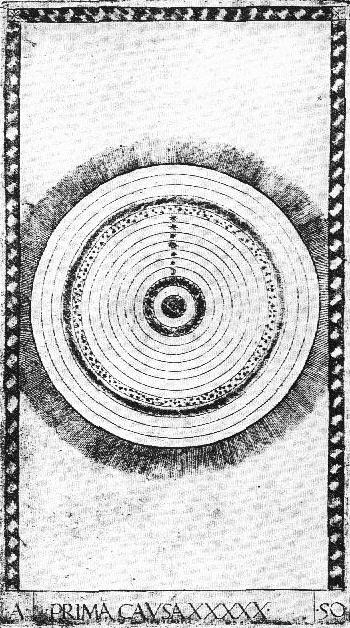
If Lazareli were responsible for the E-series card, why would he have it without the four animals? It makes no sense. It is perhaps noteworthy that the later S-series "Mantegna" followed Lazarelli and had the animals in (at http://trionfi.com/mantegna/, number 50 in the E and S series).

Here are some other discrepancies.
(3) The poem gives Mercury a seven reed Pan-pipe:
789ff. Clothed in the dress of shepherds by the order of Jove, he played on seven reeds of unequal length.
But we see in the illumination (above), essentially the same as the E-series "Mantegna," that Mercury is shown with a flute, with holes in it. Why seven reeds, of seven lengths? From the context in the poem, it seems to me that he wants the notes to be the "music of the spheres," the seven notes of the musical scale corresponding to the seven traditional planets. He discusses this point in his exposition of Musica, the personification of Music.Conscius et iuuit dulcia furta Iouis,
Hicque Iouis iussu pastorum indutus amictu
Disparibus septem iam cecinit chalamis.
1016ff. Seven tones were produced by the revolution of the sky, and the
reed-pipe of Pan had seven tones. Mercury constructed the seven tones of heaven
under the likeness of his heart and devised the first lyre.
Mercury's reeds are a bridge between the terrestrial and the celestial. If he doesn't have a lyre, he has to have a Pan's-pipe. For some reason, Lazarelli's illuminator didn't change the picture to suit Lazarelli's taste. But since Lazarelli is in opposition to that image, one would expect that at least in the engravings, if Lazarelli had any say in them, Mercury would have a Pan's pipe.Fiunt septenae caeli uertigine uoces
Et septem uoces fistula Panis habet.
Muniuit septem caeli sub imagine cordis
Mercurius primam comperuitque lyram.
(4) Here is part of Lazarelli's description of Luna, pertaining to her horns:
920ff. Cynthia was seen, brilliant with her shining horns and then Phoebus, having arisen with his shining horses, came forth.
Gentibus Ortigie Cinthia uisa fuit.
Cinthia uisa fuit fulgenti splendida cornu:
Hinc Phoebus nitidis exiit ortus equis.
She embraces the curved arms of eight-footed Cancer by whose hospitality she was made more moist. Then you can favorably store up anything in water for yourself.
984ff. The full moon shines with its disk renewed by its joined horns.
For the Moon, Lazarelli mentions that there is a Cancer in front of it. Just as the autumn, in Scorpio's month, follows the heat of the summer sun, as Lazarelli says in his section on Sol (lines 605-630), so moisture follows the Moon.These are nice specifications, not that unexpected, given Luna's connection to the sea. Here is an example, the top of an early 1460's Florentine engraving, the "Luna" of Baldini's "Planets" series. It even has the horns that he wanted Luna to have.Plena nouo iunctis cornibus orbe nitet.
Occupat octipedis iam concaua brachia canchri
Hospitio cuius redditur humidior.
Tunc poteris felix in aqua tibi condere quicquid

In Lazarelli's manuscript, as in the "Mantegna," Venus is not horned (see below). The crab is not apparent either. On the left I have put the "Mantegna" Sun card, which has a Scorpio before it. If the engraving and illumination are following Lazarelli, there should be a crab in the same place relative to Luna. In the illumination there clearly isn't one. In the "Mantegna", some copies have a faint outline above the horses' head somewhat like a crab, as below (from http://trionfi.com/mantegna/e/e-mantegna-tarocchi/41.jpg), but this may be an illusion, due to imperfections in the printing, or somethng added after the card was printed. For example, the image I am talking about is there on a small version of the British Museum's card, but disappears if you click on the image to make it larger (http://www.britishmuseum.org/research/search_the_collection_database/search_object_details.aspx?objectid=1446860&partid=1&output=People%2F!!%2FOR%2F!!%2F134324%2F!%2F134324-3-17%2F!%2FPurchased+from+Luigi+Angiolini%2F!%2F%2F!!%2F%2F!!!%2F&orig=%2Fresearch%2Fsearch_the_collection_database%2Fadvanced_search.aspx¤tPage=2&numpages=10). Copies of the E series that do not have such marks scattered around the blank space have no such outline (e.g. one sold recently at Christie's, http://www.christies.com/lotfinder/lot_details.aspx?intObjectID=5276205, http://www.superstock.com/stock-photography/mantegna+tarocchi).

(5) Then there is Luna's chariot itself and its horses. Lazraelli describes her chariot as being shaped like a ship (lines 975-976).
The chariot has the shape of a ship as if it were traversing the seas. For the moon holds quite a bit of power over the flowing waters.An example is the Baldini just shown. In the illumination as on the card, however, Luna's chariot has no suggestion of a ship. Furthermore, he describes the horses as one dark (speckled, actually) and one white, with the dark one ahead of the light one (969-974).
Nvis habet formam tamquam legat equora currus
Luna satis liquidis nam dominatur aquis.
The silver moon hurries along in her flashing chariot. She hurries along, drawn by her two swift horses.One of them is bespeckled on his body with tufts of black hair.On the "Mantegna," the horses are both the same light color. In this case, the illuminator seems to have tried to follow Lazarelli's account: he has made one horse white, almost invisible in fact, the other black. So why didn't the engraving follow the illumination, if it came after it and was done to Lazzarelli's specifications?
The other has a white neck with a snow-white mane.The dark horse is frist and watches over the drk night.The white horse has the times of bright light.
Iam properat bigis argentea luna coruscis
Festinis properat vecta duobus equis.
Quorum alter nigro conspargit corpora villo
Fert alter niveis candida colla iubis.
Fuscus equus prior est et nocti praesidet altrae
Albus equus clarae tempora lucis habet.
(6) Then there is Saturn.

Lazarelli describes Saturn as having a thin beard, unlike in the illumination and the card.
((445) By nature, meanwhile, he starts to cover his chin with signs of a beard and while he walks he fixes his small eyes on the ground.
Lazarelli wants to contrast this meager beard with Jupiter's full one and the Sun's lack of beard:445 Natus in hoc parua spargit lanugine mentum
Paruaque dum graditur lumina figit humi.
509ff By nature he [Jupiter] has a blushing complexion with white mixed in. His hair is long and his full beard is becoming...
The Practica Musica has a small suggestion of what Lazarelli wants more of.Horum letatur Iuppiter hospitio:
Natus habet uultum mixto candore rubentem,
Caesaries longa est barbaque plena decet.
...
655 Always the Sun is beardless and always beautiful in respect to his hair.
Semper et imberbis semper Sol crine decorus.

But the "Mantegna" engraving gives him a long beard, following the Libellus; Lazarelli's iluminator does the same.
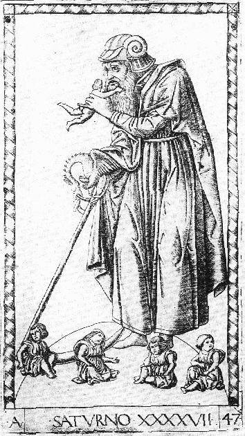
As we see, it is Jupiter that gets the short, thin beard, both in the "Mantegna" and in Lazarelli's illumination.(For the illuminatin, scroll down a couple of paragraphs.)
(7) In describing Jupiter, Lazarelli talks about a "three-pronged lightning bolt," where the "Mantegna" and Lazarelli's own illumination have only a single-pronged arrow:
467ff. Now Jupiter, sitting on his majestic throne and squeezing his three-pronged lightning bolt in his hand, must be sung by me. He is adorned in regal attire and
is serious in his expression. A royal golden crown binds his head.
You will notice in the illustration (below) that there is a rainbow and a lady sitting on it. Lazarelli explains the bodies lying about underneath and the eagle overhead, but leaves out the rainbow and its lady, Iris:Est mihi nunc residens augusta in sede canendus
Iuppiter astringens tela trisulca manu,
Regali ornatus cultu facieque seuerus,
Regia cui nectit fulua corona caput.
Phlegra is the name of the place where Jupiter defeated the Titans; it is analogous to the rainbow that follows a storm, but Lazarelli uncharacteristically does not relate his story to the image.471ff. The horrible bodies of the giants, whom the father struck down when he sent out the fire of lightning, lay scattered here and there. The winged arms-bearer of Jove, which carried lofty one the Idean prince to the stars, stands above with open wings. This is the form of Jove. These are the appearances of thunder...(479) Whence they ascribe the causes of things and whence the first religion of the ancients arose, I will explain this in a few words. When in war Jupiter overthrew his fleeing father, and Phlegra was a witness to such a great storm, he buried his enemies under the high mountains, and the rage of lightning consumed his savage enemies. Then he received all the reins of the world by conquering, and he was celebrated far and wide by the leaders so that the name of Jove and at the same time his monuments together would remain, and his pledge of friendship would stand for a long time.

(8) Then there is the poem's account of Apollo. Above is Lazarelli's illumination, the same as in the Mantegna, to which we may suppose him referring
(73) Now I remember that I have seen you elsewhere bearing bow and quivers, sweet plectra and the lyre. The Penean virgin was washing her shining hair. Youths were present and cheeks without blemish. I saw you, Delphicus, among the Hyperborean griffins. I knew you beforehand. The crow was near you. Who changed your culture? Who changed the mark of honour of your brow? Perhaps I am not permitted to know everything.
He is perhaps thinking of the "Harmony of the Spheres" image of Apollo,or the one in the Schifanoia, which has the crow.


When he asks "Who changed your culture?" I think he is referring to the designer of the "Mantegna." Lazarelli has a suspicion that he is a Ferrarese, and if so, Borso might be able to stop this new, impoverished manner of depicting the god.

(9) When Lazarelli comes to Musica, Poesie, and the Muses, the discrepancies are more subtle, not contradictions as such between the poem and the cards, just innuendos I seem to be picking up, through his emphasis on some things and de-emphasis or omission of others.
He describes Musica mainly as ruling over singing. Here are some examples:
He does include some examples of singing without words, but not nearly as many. Then at the end, as though to reconcile all this with the actual picture, he says1030ff. Singing moves the feet with sure order. Singing brings on sleep and soothes bitter anxieties.
...
1040ff. A lover soothes his lover's dreams by singing. The heart of an angry mistress is bent by songs. The heart of an angry girl will become tearful if you sing before her doors.
Cantus agit certa sub ratione pedes,
Cantus agit somnos et curas lenit acerbas.
...
Cantus agit certa sub ratione pedes,
Cantus agit somnos et curas lenit acerbas.
Suppremit iratos cum furit ira nocens
In longum uitamque trahit morbisque medetur
Tristibus et suadet gaudia pectoribus.
1057ff. Behold! Music resides on the swan's back, for among the birds the white swan sings very sweetly. A flute sits in her mouth and you see musical instruments around her. The reed pipe and the sweet-sounding lyre stand there. May whosoever sees this painted likeness of Singing be able to recognize properly the reason for her form.
Despite the flute in her mouth, she is still "the painted likeness of singing," Lazarelli insists. He is a poet, after all: to him music is mainly poetry put to music.Respice cigneo residet iam Musica tergo:
Nam canit inter aues dulcius albus olor.
Buxus in ore sedet circum instrumenta uidesque
Musica: stant calami dulcisonaeque lyrae.
Viderit hanc Cantus pictam quicumque figuram:
Iam formae causam noscere rite queat.

Poesie is the one whom he worshipped from his first years; it is she who sings of great deeds and far places, despite the fact that "she forces out sweet measures of the boxwood flute from her mouth" (after II25). Lazarelli must have been aghast at the "Mantegna's" depiction of her with a flute in her mouth, she who is first and foremost the source of melodious words.
It is the same with the Muses. The first who comes, of course, is Clio, one of only two in the "Mantegna" who isn't playing an instrument:
After describing Euterpre and her flute, he notes that2.166. Clio favors erudition, her love of praise.
Clio laudis amore cupit.
191. Each of her sisters holds musical instruments.
Instrumenta tenet iam musica quaeque sororum.
For a poet, that is hard to swallow. The Practica Musica shows only Euterpe with an instrument; the rest are speaking (except Thalia, there one of the Graces).

Even in the Belfiore series, only three of the Muses had instruments (see http://it.wikipedia.org/wiki/Studiolo_di_Belfiore). But in the "Mantegna," and presumably Lazarelli's versions in his manuscript, they all, following Capella, are playing their instruments.
One glaring omission from his interpretations is in regard to Thalia. We would not learn from the poem that she is the only Muse not standing--depicted on the ground both in the "Mantegna" and Lazarelli's manuscript-- nor why. In the Practica Musica, she is standing--perhaps how Lazarellli would like to see her.
Well, I hope that is enough to show that while the poet is describing the various subjects of his poem, he has before him the corresponding E-series card, from which his illuminator also works, sometimes making changes to suit the poem but usually, if the alterations in what is already there are required, not doing so. Lazarelli's poem may have had an effect on the S-series, as its changes from the E-series do occasionally reflect the discrepancies (ie.g. Saturn's beard and the four animals on the Primo Causa), but it was the cards from the E-series that Lazarelli bought in Venice, prompted his poem, and from which his illuminator worked.
Huck, in reply, says that perhaps Lazarelli wrote the poem before he had a chance to look at these cards. But the question, "Who changed your culture?" suggests that he in fact is reacting to the card, as part of a trend he is against. It seems also that if he didn't like the image on the card, he would have had it corrected.. Huck replies that perhaps he didn't have much control over the illuminator, "his Appeles." It seems to me that illuminators generally do what they are told, or else they would not get many commissions. And even if he had some reason not to correct the illuminations, he would have had the engravings reflect his views. Huck says that perhaps Lazarelli had no control over that either: perhaps Zane called the shots, and told the engraver to follow the illuminations. But in that case why wouldn't the engraver have made one of Luna's horses black and the other white, as in the illumination?
LETTER PUNCHES AND WATERMARKS
These last considerations, admittely, are somewhat speculative. There remains two pieces of harder data. First, Sweinheym's Ptolemy was known for its very clean printing, accomplished by the use of letter punches. On that Hind was initially mistaken, as an article by Tony Campbell describe. It is at http://maphistory.net/LetterPunches.html, first published in Print Quarterly IV:2, June 1987. He mentions two errors made byHind in relation to early map engravings.
Hind "praised the lettering on the assumption that it had been hand-cut, although he acknowledged his error on being shown some enlarged photographs by Hinks in 1943." (Campbell's references are Hind, Early Italian Engraving I p. 292, and A. R. Hinks, "The Lettering of the Rome Ptolemy of 1478," [/i]Geographical Journal[/i], C1, 1943, p. 189.) The use of the letter-punch in the Ptolemy maps had already been pointed out by Wilberforce Eames in "A List of Editions of Ptolemy's Geography," in J. Sabin, A dictionary of Books Relating ot America, New York 1886, no. 66470, but Hind was unaware of this source.
The other error has to do with the so-called Eichstatt Map of Northern and Central Europe by Nicholas of Cusa, insecurely dated 1491. Hind attributed it to the Reyser brothers, either Michael of Eichstatt or Georg of Wurzburg. It in fact was made in Italy with the same set of letter punches that was used for the Ptolemy maps, according to Campbell. So it, too, is a product of the Sweynheim shop under Buckinck, or a successor.
Campbell says that each set of punches was so different that particular sets can be identified in different publications. Moreover, punches for making ordinary printing type could not be used; a special set had to be constructed just for engravings, and using it required very specialized training. He adds that "Punched lettering seems to have been restricted to maps." At least he knew of no other application by the time of posting, although leaving it open whether any other application might someday be discovered.
If it could be determined that the "Mantegna," too, was lettered by means of punches, that would count as evidence in favor of his producing them. So how do we tell the difference? It is not, as we might suppose, by looking for absolute uniformity in the appearance of the letters.. Hinks, in his article correcting Hind, said,
So do the letters of the "Mantegna" show any of these indicators? Huck produced the following:A certain variation in the detail of the letters might be produced by striking a little obliquely and so varying the amount of burr to be smoothed away; also by touching up with the graver names imperfectly punched, as well as by irregularity in inking and roughness of paper. The strong evidence for punching is the irregularity of orientation, of spacing, and of alignment, much easier to explain as due to difficulties of punching than of engraving between parallel scribed liens.

and commented:
He aded:We see two "O" and both have opposing parts of a thinner and a thicker line - which would be rather difficult for the engraver to arrange it, if he had made it by hand only.
In this case the thinner line appears in different directions ... that's probably "not desired", but just happened by disorientation, cause it's not easy to recognize at the O-stamp, how to hold the stamp, when you punch it (at other letters we also recognize, that the stamping hand had trouble to find the correct vertical position).
If he had made this by free-hand-engraving, one would wonder, why the designer made such a blunder with the "O".
And from the following we also learn something:
http://www.mfa.org/collections/search_a%20...%20ll_start=1

My response is that these cases are not like the ones the experts dealt with in 1943: they are very subtle differences. Were these "O's" and My "S's" punched, but with a different tilt? I tried blowing them up and rotating one until it matched the other, more or less. Here is the O. The first one, on the left, is rotated about 30 degrees from the horizontal:

I can't make it match any better than that. Maybe you can. Were these done by the same punch? (If you are supposing different punches, or one punched and the other not, the case is hopeless.) They look different, but I'm no specialist. Hinks made a point of saying that punched letters can have slight variations even with the same punch. A calligrapher who also engraved lettering and used letter punches might know.
For the "S," I took the "S" in "Sol," the next planet, from the Bibliotheque Nationale's copy of it in Lambert. For comparison, I used the "S" in both the Venus the one in Lambert and the one you posted. Then I put them alongside each other and rotated the ones in "Venus."


The first one doesn't look the same as the second, nor either to the third, to me, but I'm no specialist. And if you allow that there was a mix of punched letters and engraved letters, and different punches, the situation seems even more difficult.
The lettering on the "Mantegna," is pretty different from the letters on Sweynheim's maps, although the same style, as you can see below. Notice in the "Mantegna" the variations in the O, the M, the N, and the size of the print. I cut and pasted these from the Trionfi images. (The images in Lambert, and also elsewhere on the Web, are much clearer, but Trionfi's will do.) In contrast, the map's letters are all the same, and only in a few quite different sizes of print.

The Ptolemy map is at http://www.sanderusmaps.com/antique-maps/africa/africa-north-_6654.cfm
Also, there are no backwards N's on the Ptolemy. Backward N's are easy to make when one is hand letteringan engraving, because one has to remember to write backwards. To me the "Mantegna" looks hand-lettered. But if so it's very good lettering, compared to other hand-lettered engravings I've seen.
I am not saying that the letters on the "Mantegna" weren't punched. I'm just saying that it's beyond my competence to say one way or the other..
Then there is the issue of watermarks. Ross G.R. Caldwell posted (at (http://forum.tarothistory.com/viewtopic.php?f=11&t=637&p=9725) a link to a Christie's auction notice in which an expert identified the watermark on a group of E-series "Mantegna" prints (the one we're interested in) as one in use in Northern Italy 1465-1473 (http://www.christies.com/lotfinder/lot_details.aspx?intObjectID=5276205). This tends to count against Trionfi's proposal of c. 1475 Rome, because it's the wrong part of Italy and earlier than would be expected. However it is possible that paper produced in Northern Italy was shipped to Rome and stored until use in 1475.
THE S-SERIES
The S-Series "Mantegna" is "broad-manner". Christitie's dating of the S.-series print that they were selling was 1475. For us, the question is, could Lazarelli, or Zane following Lazarelli, have had anything to do with that collecdtion of engravings?
Levenson observes that one difference between the E- and S-series is that the designer of the E-series knew the Libellus, and the designer of the S-series did not.
Here is Levenson on the E and S Venuses (p. 145):
This image furnishes additional proof that the E-series is the original set. The S-series print replaces the doves, which are specified in the text, with a veritable menagerie of different types of birds .

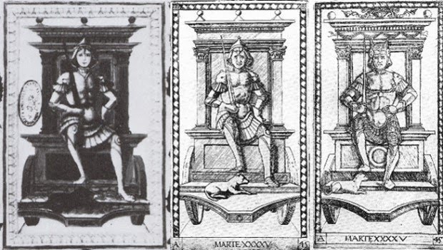
On Mars (p. 149):
The animal in the E-series print is clearly characterized as a wolf by its bushy tail and chunky proportions; the S-series engraver, however, misunderstood the image and depicted a dog instead.

And on Saturn (p. 153):
It is interesting to note that the S-series copyist omits the handle which the E-series master had indicated on the shaft of the scythe and does not emphasize the length of the figure's beard. He evidently was not himself acquainted with the Libellus description.

What the Libellus says on this point is
The relevant difference here is in the beard, not the scythe.445. He was depicted as old man, gray-haired, with a long beard, stooped, melancholy, and pallid, his head covered...
445 Natus in hoc parua spargit lanugine mentum
Paruaque dum graditur lumina figit humi.
Now we have to ask, if the S-series designer didn't read the Libellus, did he read Lazarelli'? Here we need to look at Lazarelli's poem and its illuminations, and compare them to the S-series.
For Venus, Lazarelli specifies doves:
The S-series, of course, has the "menagerie," as Levenson' calls that collection of diverse birds703 Among the birds they gave to her the snow-white dove which tends to her chicks during any phase of the moon.
703. Inter aues illi niueam dedit esse columbam.
For Mars, the change from wolf to dog goes totally against Lazarelli, who clearly specifies a wolf:
It is hard to tell what the animal is in Kaplan's small black and white reproduction of Lazarelli's illumination; but the rest of the image, incuding the placement of the animal, fits the E series image, so probably the illumination does, too.531. The wolf stands fixed and never leaves the traces of its master, and the greedy animal always desires to live on plunder.
531. Stat lupus et numquam domini uestigia linquit.
Atque rapax praeda uiuere semper auet.
 On Saturn, Lazarelli specifies just the merest sign of a beard.
I assume that the translation is accurate....445. By nature, meanwhile, he starts to cover his chin with signs of a beard and while he walks he fixes his small eyes on the ground...
445. Natus in hoc parua spargit lanugine mentum
Paruaque dum graditur lumina figit humi...
The S-series doesn't exactly comply with this description, but it does shorten the beard in comparison to the E-series. S follows Lazarelli's wishes, but only a little: it is still not more meager than Jupiter's. By the same token, the S-series has Jupiter with a fuller beard, but still not fuller than Saturn's, as Lazarelli would have wished:
510. His hair is long and his full beard is becoming...
510. Caesaries longa est barbaque plena decet...

A couple of other cards are worth looking at.When we look at Luna, we see that the S-series design follows neither Lazarelli's poem, which specifies that one of the horses be partly black, nor his illumination, which makes one of the horses black and the other white.

And finally we have the Primo Causa. Lazarelli described the "four evangelists" on the outside, and for a second time (after Luna) the illuminator complied with his idea. Moreover, the S-series broke with his E-series predecessor and did the same, giving us the same four creatures in the same four corners (from Huck's post).
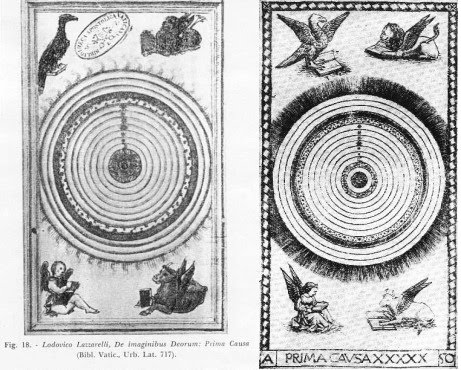
Since the Primo Causa was God, and God was Christ, it was a small jump to add these creatures; it was common practice to put them in the corners of mandorlas was a common practice, for example that below.

But the configuration was almost always different: typically the angel and the eagle were on top, and the lion and the bull on the bottom (sometimes switching sides). It is the same on the earliest tarot World card of this design that I know, the "Sforza Castle," as well as all subsequent ones.
Presumably it was felt that lions and bulls, being heavier than angels and eagles, and less frequently found with wings, should be on the bottom. To my knowledge, only the Lazarelli illumination and the S-series "Mantegna," have eagle and lion on top and the angel and bull on the bottom.
But there was another tradition which may have been more fashionable at this particular place and time (whenever that was), penetrating even the territory of the sacred mandorlas. That tradition was that of the four winds, the four temperaments, and the four elements. In his engraving "Philosophia" (http://www.fourhares.com/images/philosophia.jpg), Duerer put air and fire on top and earth and water on the bottom.
That makes sense: air and fire are lighter than earth and water. But Durer also identified the four apostles with the four elements and the four temperaments. In "Four apostles," 1520's, John is on the far left, and Mark on the middle right. (The other two are Peter, middle left, and Paul, far right.)

Duerer identified John with air and the sanguine temperament; hence his red complexion and youthful appearance. John was traditionally identified with the eagle. Mark was identified with the lion, ergo fire, and that is how he is in "Four Apostles So it could be that John, as air, could be put at the top of the Primo Causa iillumination, and also Mark, as fire. presumably on Lazarelli's instruction. And the S-series either followed Lazarelli's instruction as well, or for some other reason independently drew on the same tradition as Lazarelli did, either independently of Lazarelli or before him. All this is speculation, however. The correspondences remain puzzling.
My conclusion is that in view of the discrepancies between the poem and the S-series images of Venus, Luna, and Mars, the S-series designer probably did not have access to the Lazarelli poem. However he might have heard of Lazarelli's complaint about Jupiter's and Saturn's beards being too meager and too full, and tried to adjust the images accordingly, without understanding what Lazarelli was getting at. He also might have heard about Lazarelli's complaint about the lack of animals in Primo Causa and adjusted the image there, too. Why they have the same configuraton in Lazarelli and the S-series remains unexplained. Perhaps someone knows some other explanation, besides supposing either that the "four elements" interpretation of the creatures was in fashion, and adopted either by the S- series designer, or else the S-series designer had some instruction deriving ultimately Lazarelli or from someone who had seen the Primo Causa illumination in his manuscript.
No comments:
Post a Comment